Our First Usability Test
Our first test featured two individuals who knew each other beforehand. We thought this would be the best method for our first usability test because, before the first test, it is most likley that there will be issues, and we think that any minor issues with a single person’s understanding of the product could be mitigated by the other person, and vice versa. We also think that a group of two, lingering around in a public area, is the most likley group to use our product, as a single person is probably walking outside because they have somewhere to be, but a group of two may be simply strolling around, etc., and decide to stop by and use our product.
Our protocol included first presenting our group with a scenario: they are walking on the street, and out of the corner of their eye, they spot a massive touch screen, projected onto a building, and they are interested in it, so they walk up to it. Beyond this, we let our users walk up to the display and begin interacting with it. We found it fitting to not present to them any goals of what they should be trying to do, because we found this situation more realistic––because this technology would exist, no one would instinctively know to walk up to it and begin posting art. Thus, our test also encompassed ensuring our users are able to self-discover all features of the product.
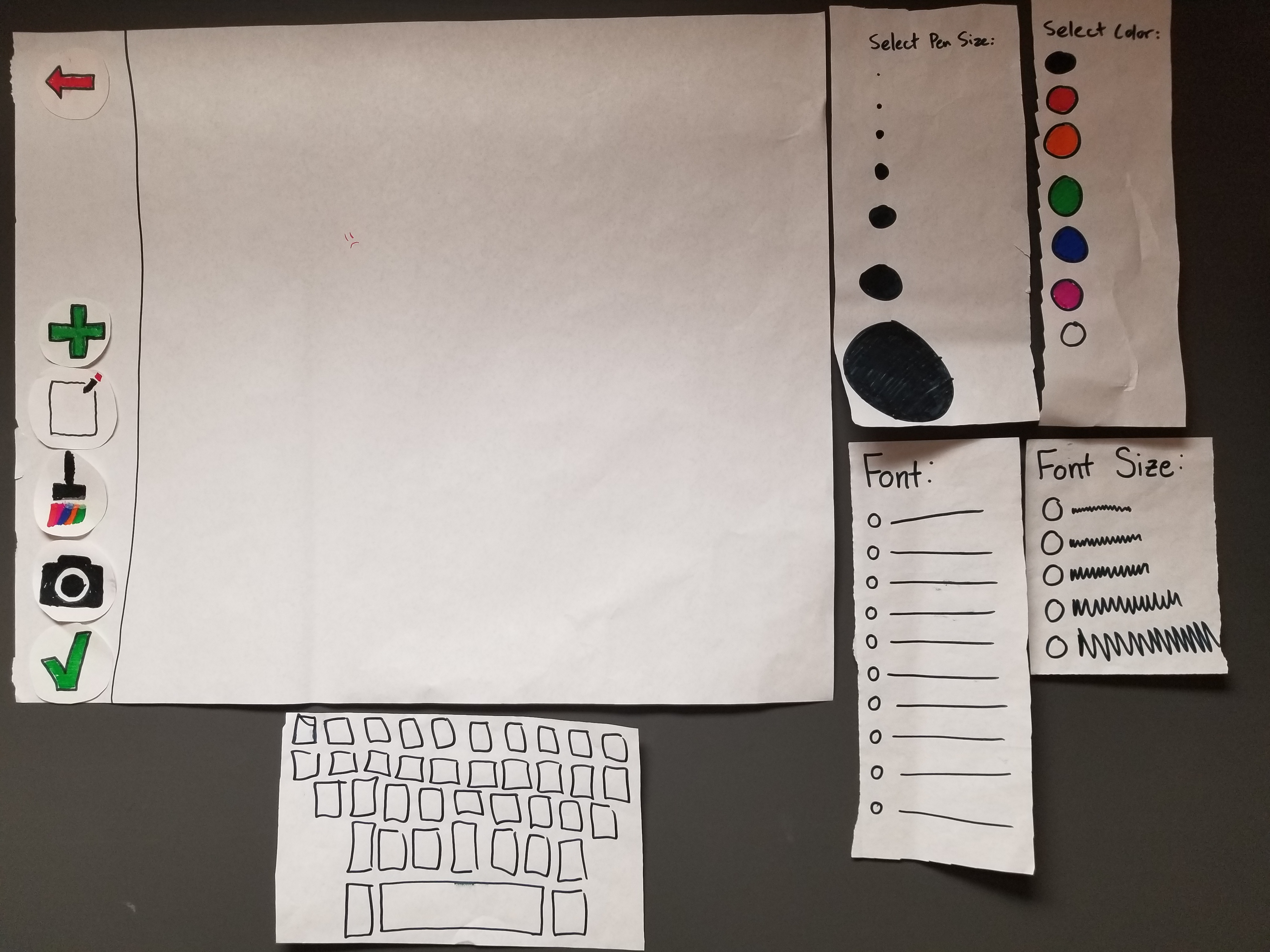
Our Computer was Liv, our Facilitator was Peter, and our Notetaker was Teiheim. Our posters presented a few issues: for one, they didn’t know how to select a different style of paintbrush and font, because these selectors disappeared, so our new design will feature them as permanent elements of the display. Also, the users didn’t know whether “AirDrop to: …” meant they were adding or receiving a photo from their camera roll, so we should make this information more explicit. Lastly, one of our users confused the red flag for a “help” button, so we will create a new button making its function of flagging content more explicit.
Findings: Cognitive Walkthrough
| Prototype | Issue | Severity |
|---|---|---|
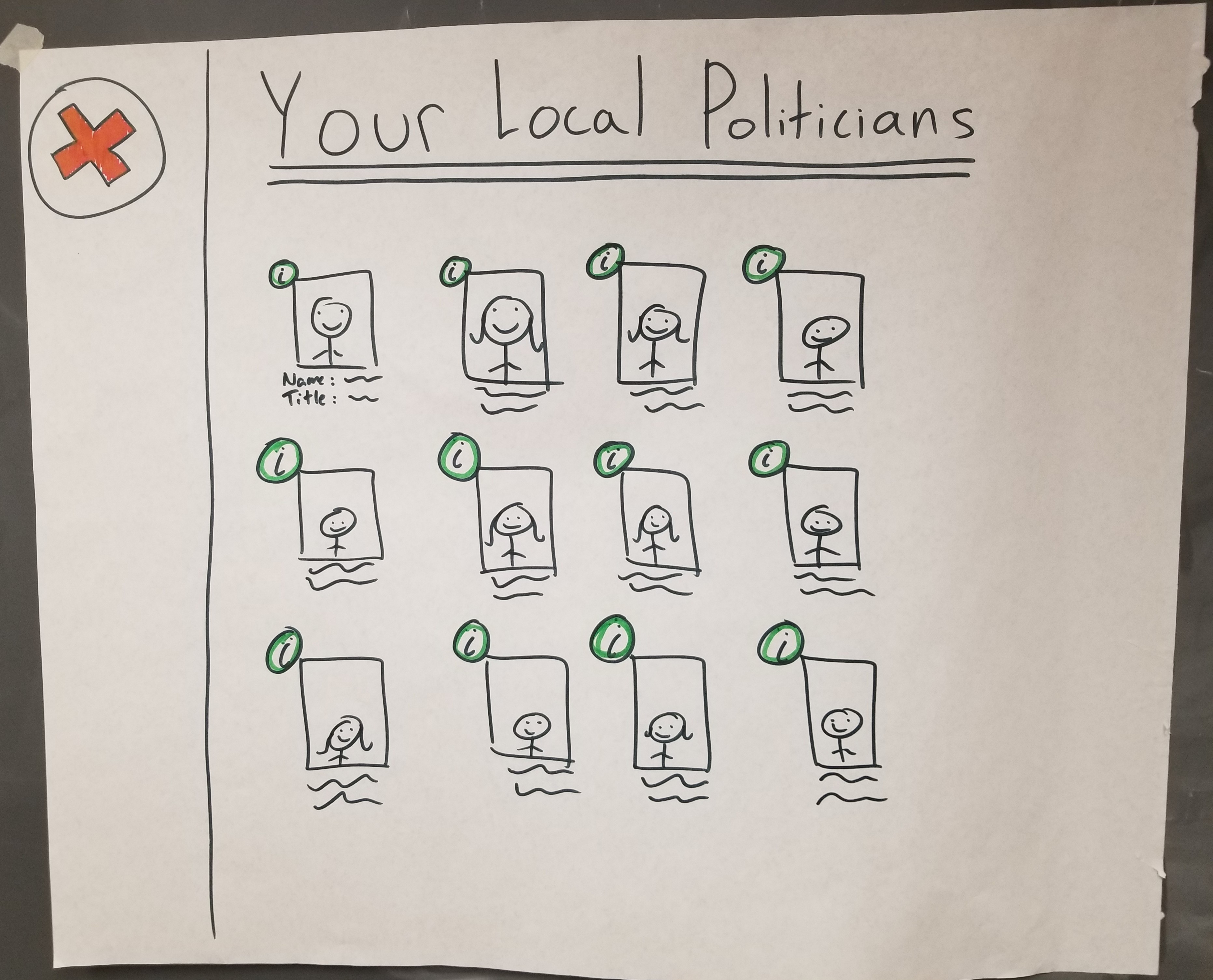 |
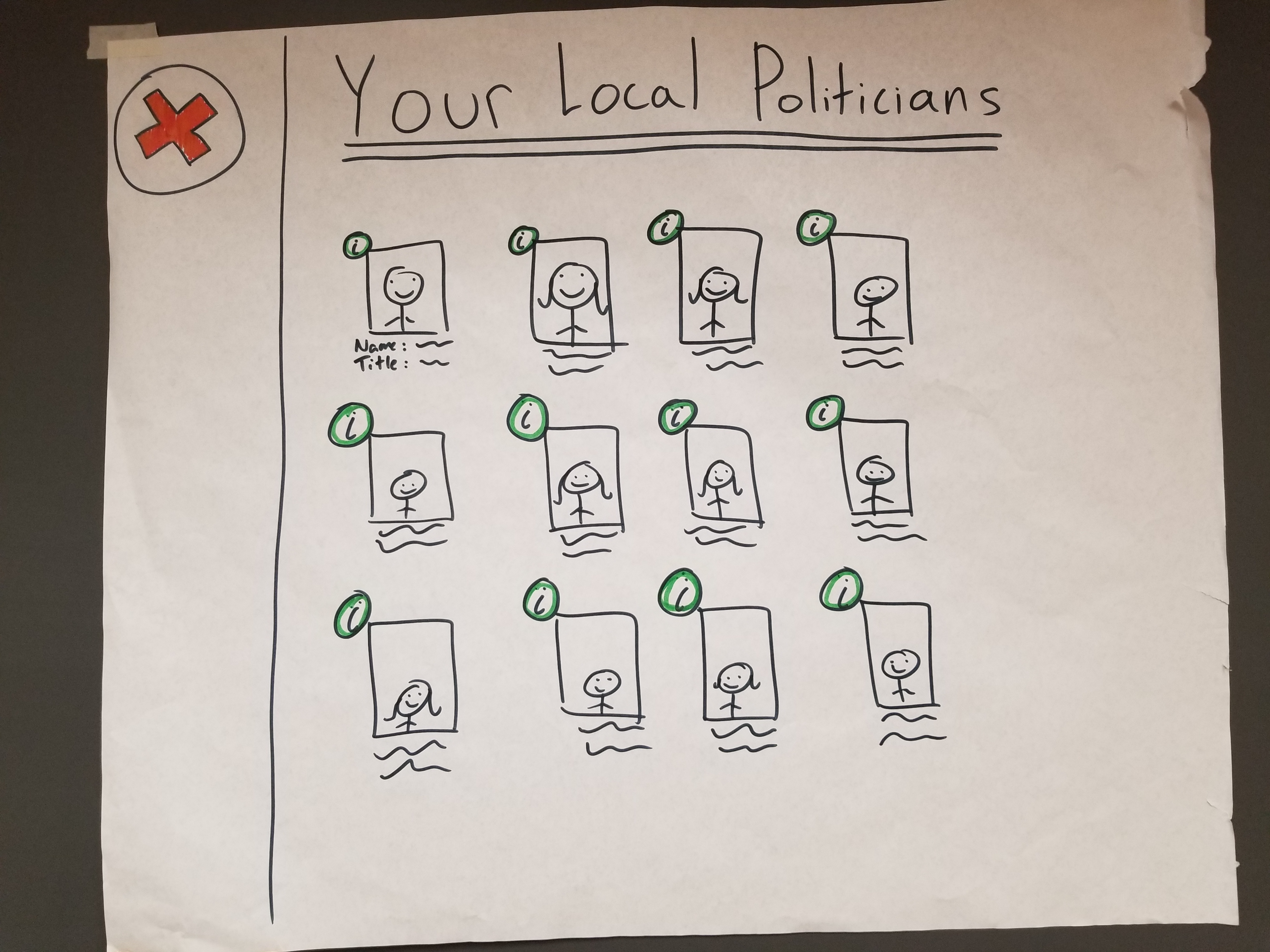
hard to find politicians with no search feature | 1- doesn’t significantly impact functionality |
 |
unclear how to add media to a post | 2- doesn’t prevent functionality but inhibits full access |
Revisions: Cognitive Walkthrough
| Image | Revision |
| :— |:— |
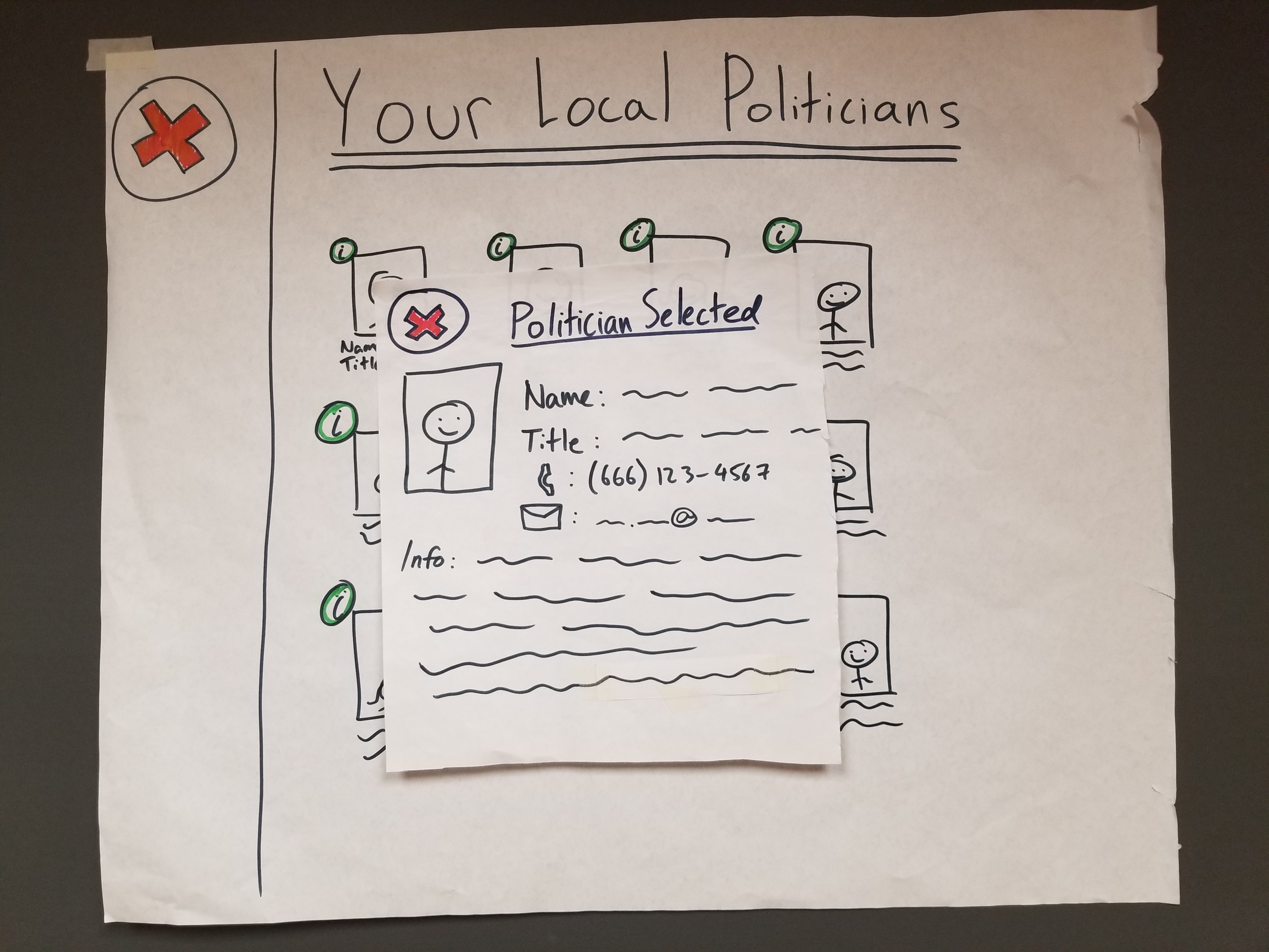
| 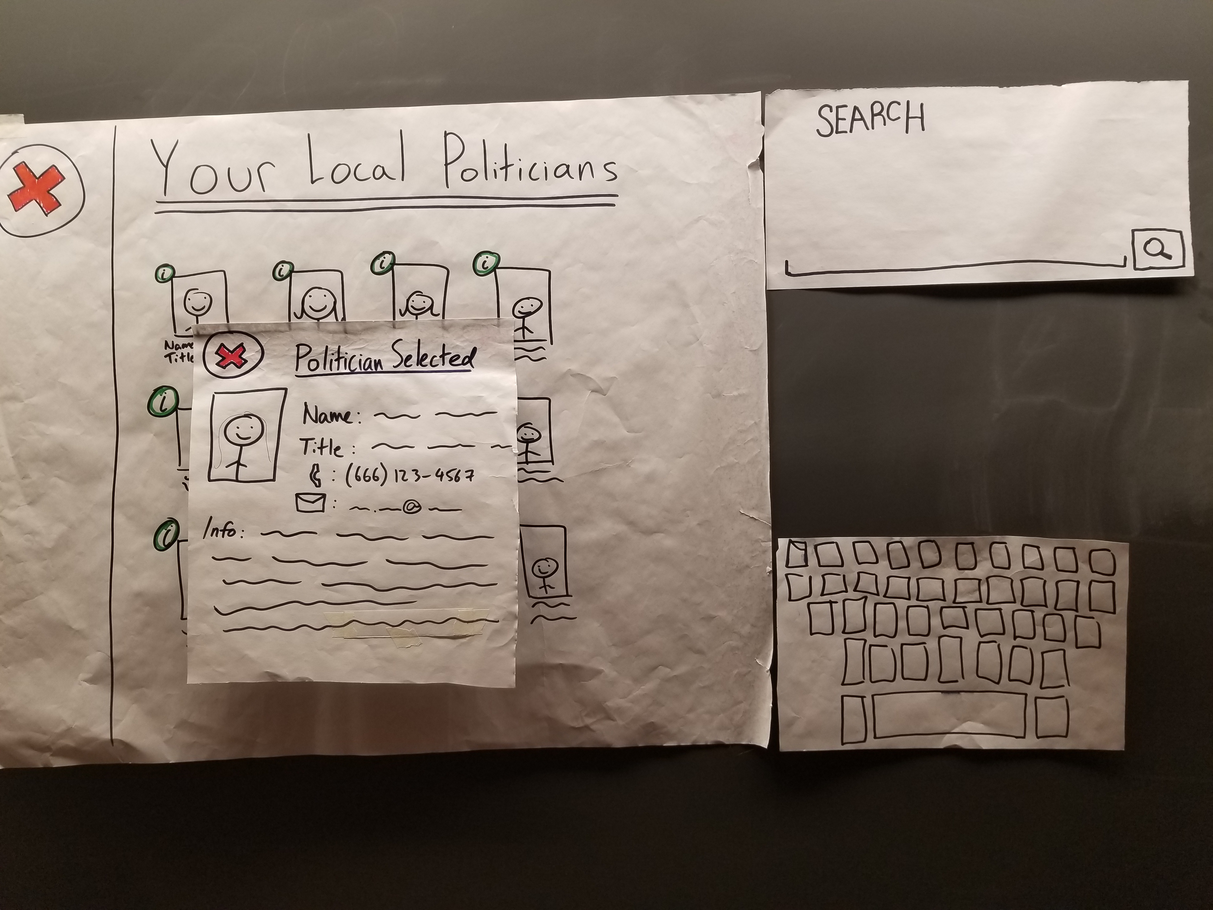 | The politicians interface now has a search function. |
|
  | Users didn’t understand the button’s purpose. The new plus sign is labeled to fix this. |
Findings: First Usability Test -
Painting/Typing Issues, Severity: 3
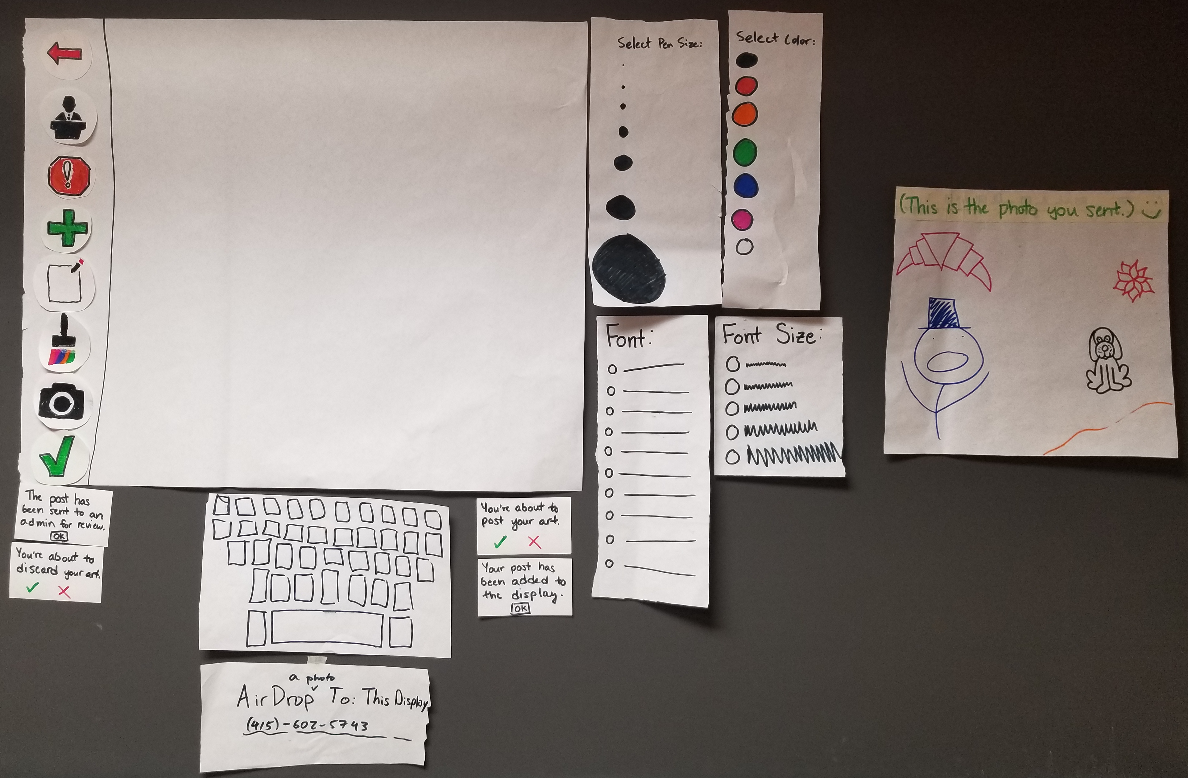
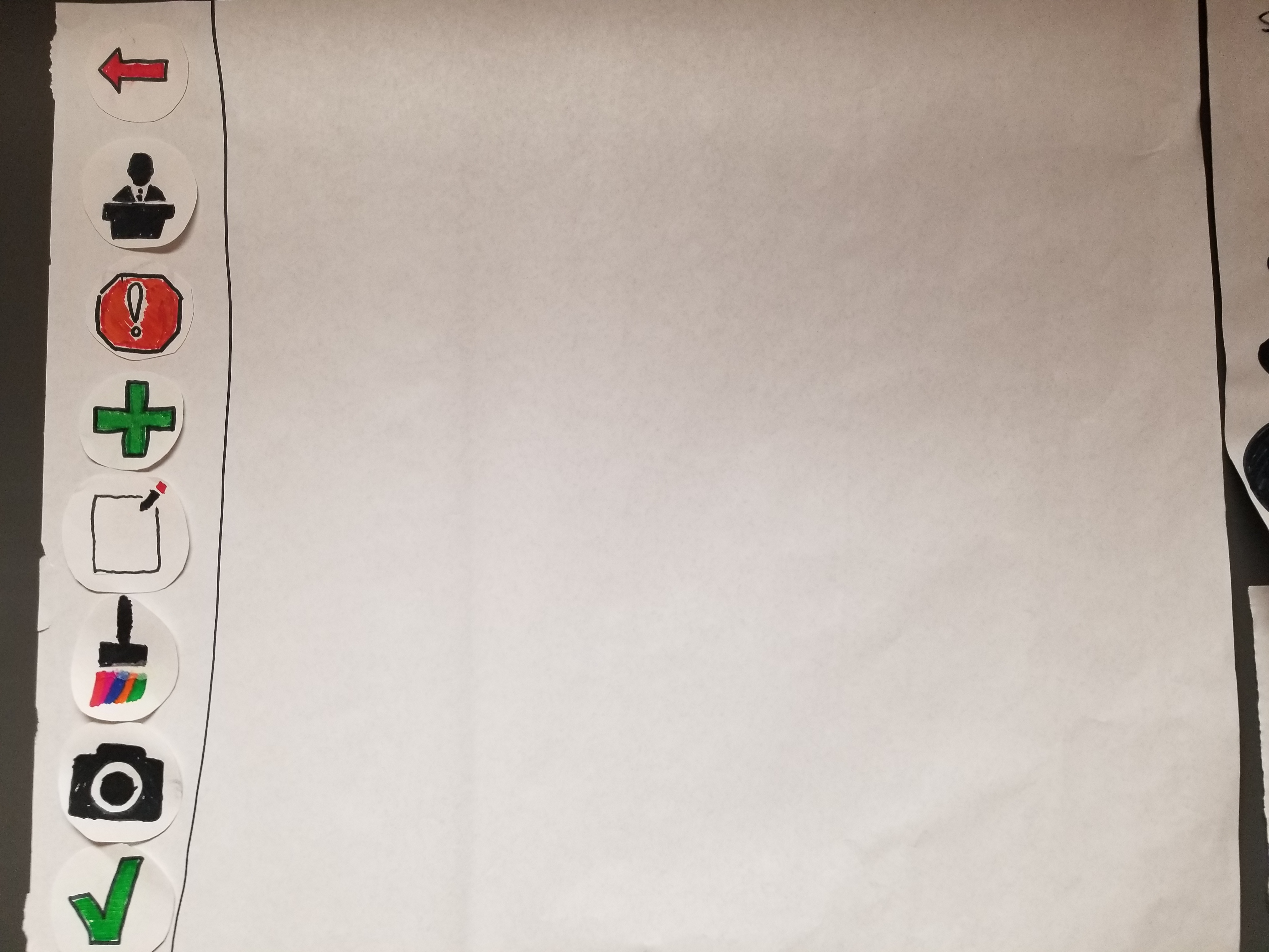
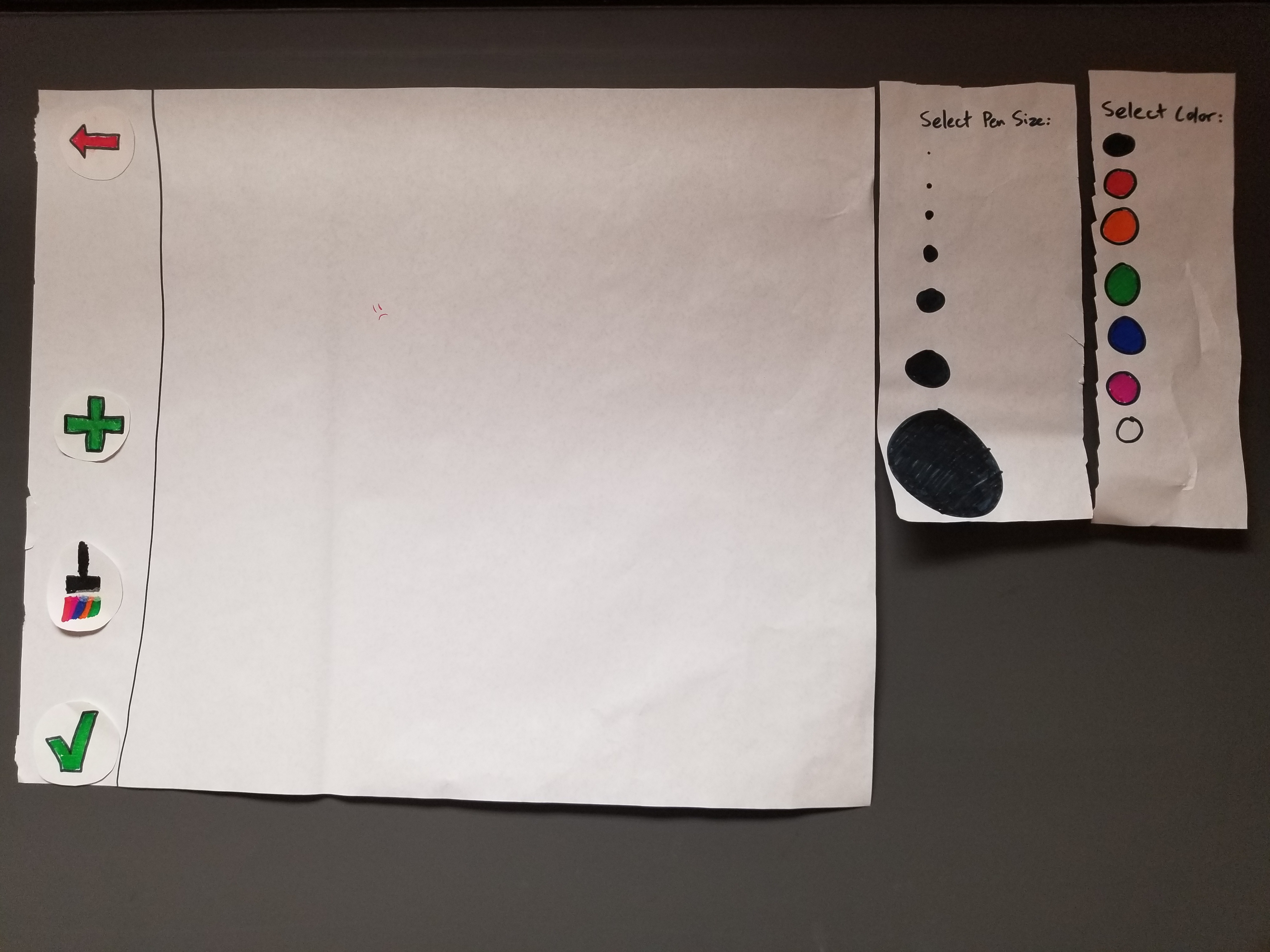
Users did not know how to change colors, pen sizes, or font styles after selecting their initial styles. We have changed the layout such that these elements are now permanent fixtures beside the original “screen.”
Misunderstanding the “Photos” Section, Severity: 2
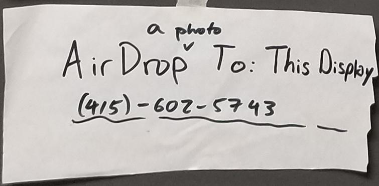
Users did not know whether the photo section was to be used for adding photos or taking photos, nor did they know whether they were supposed to send or receive a photo during the screen that says “AirDrop to: …” We addressed this layout issue below:
Misunderstanding Flag, Severity: 1
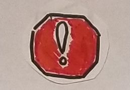
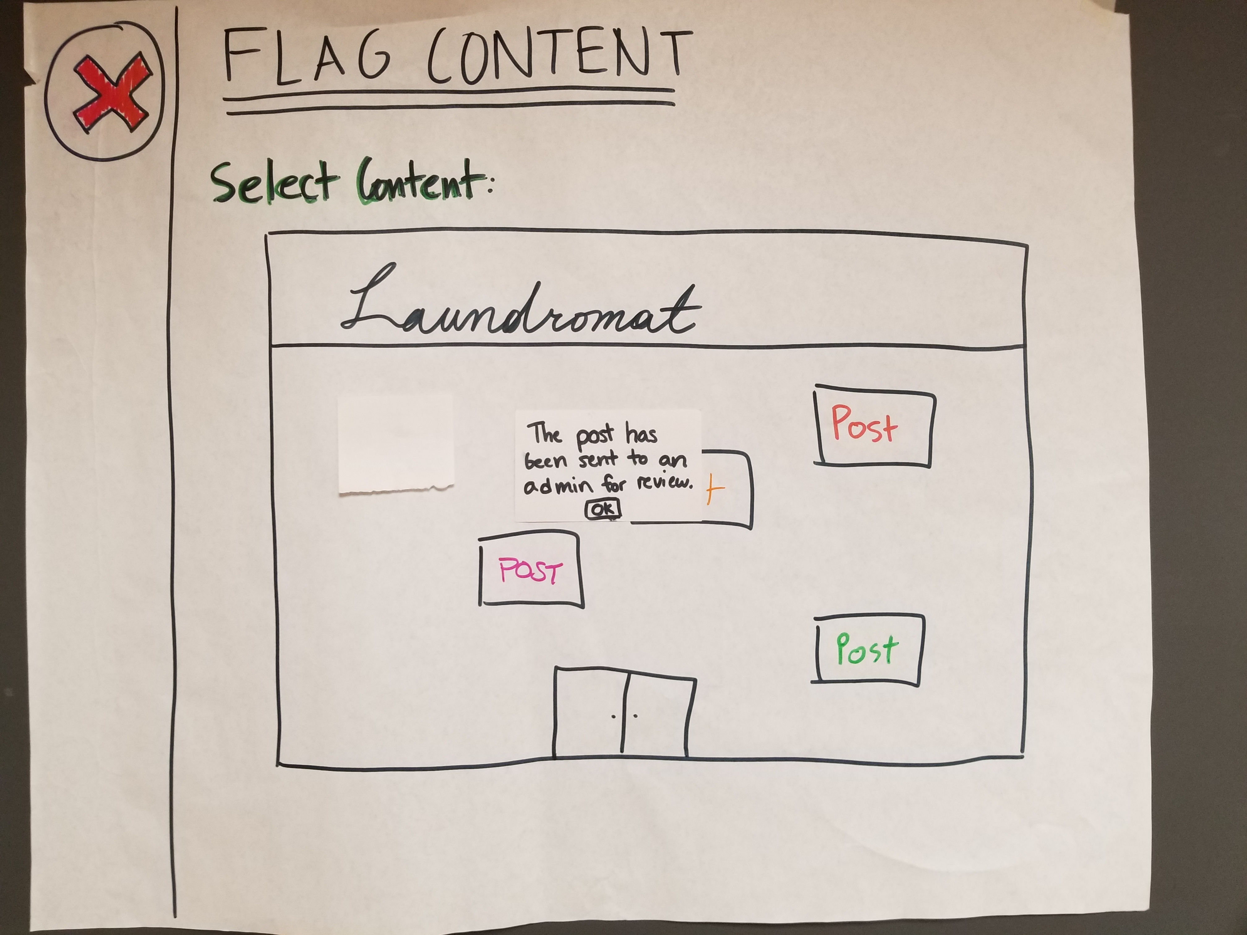
One of our users confused the red flag for a “help” button, so we will create a new button making its function of flagging content more explicit, as shown below:
Revisions: First Usability Test -
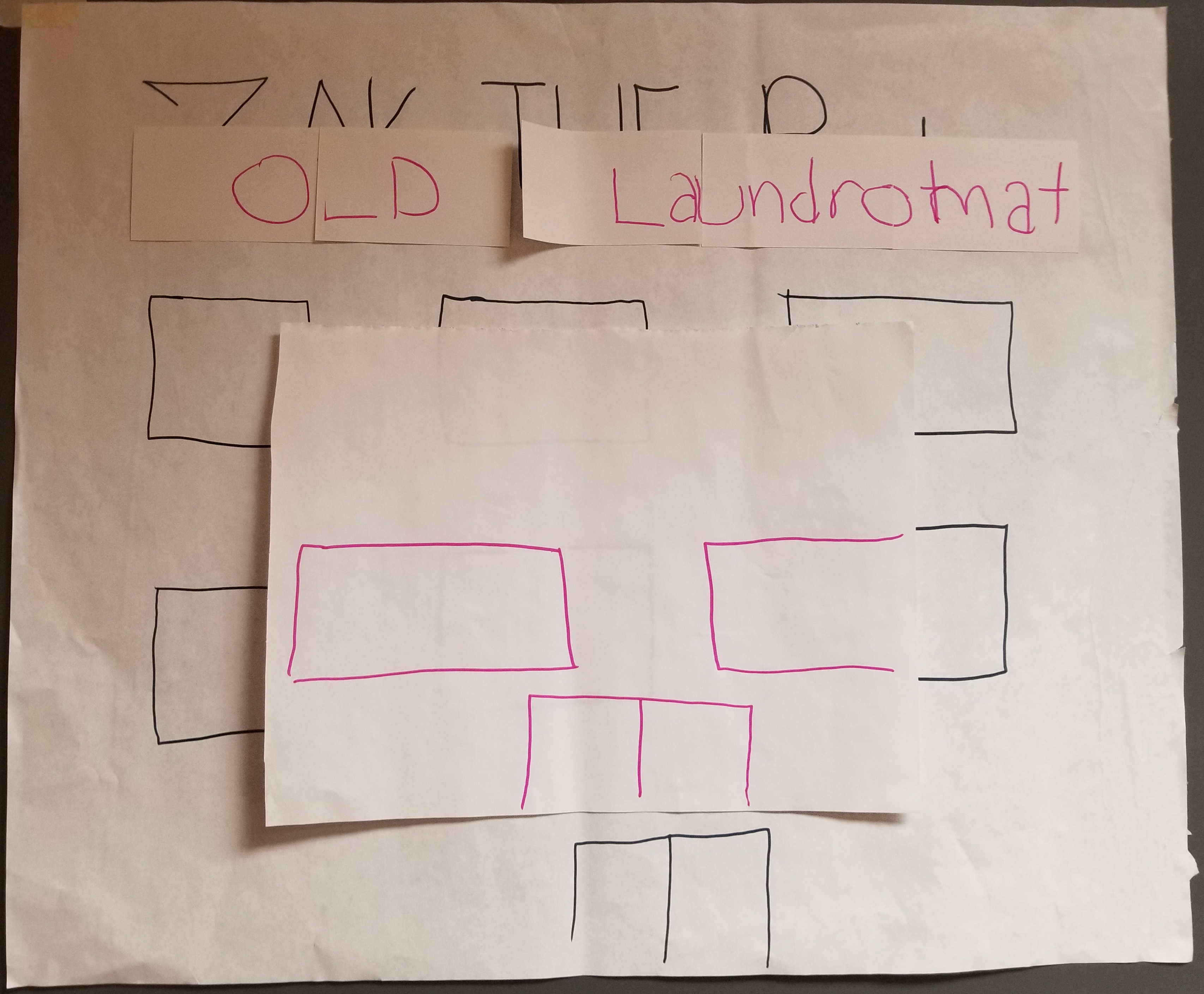
Here is an overview of our revised prototype:
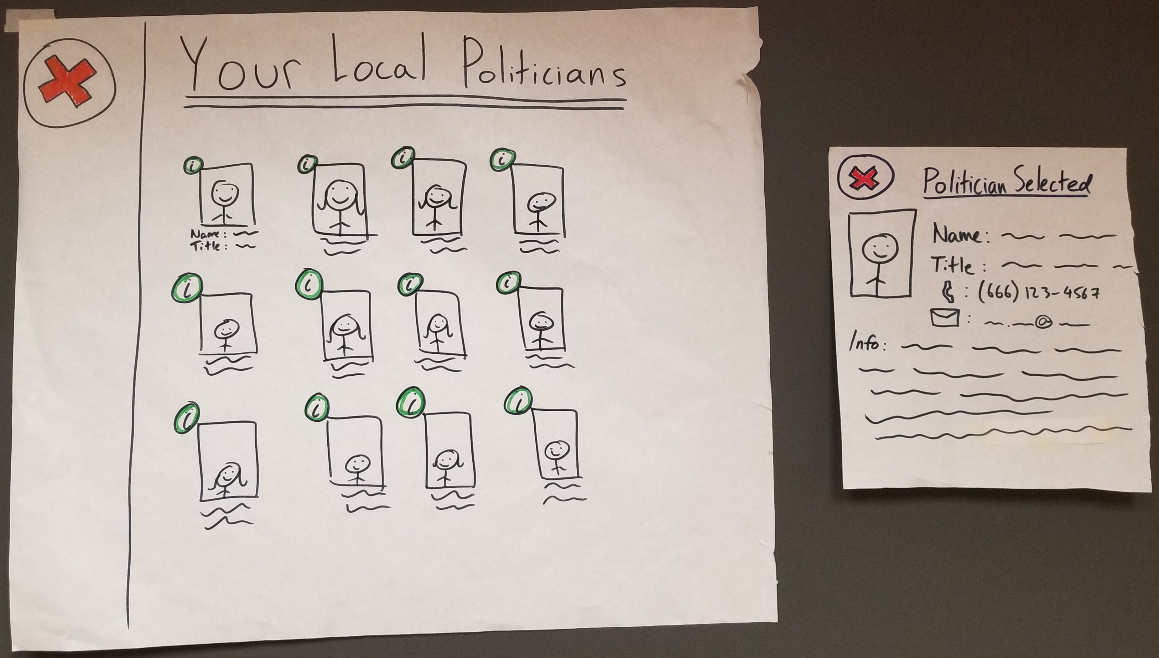
Looking at Local Politicians

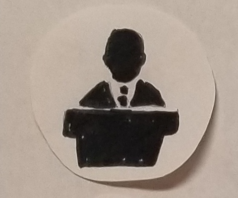
Posting and Flagging Content
**Post Content**
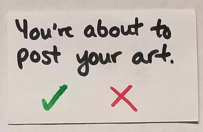
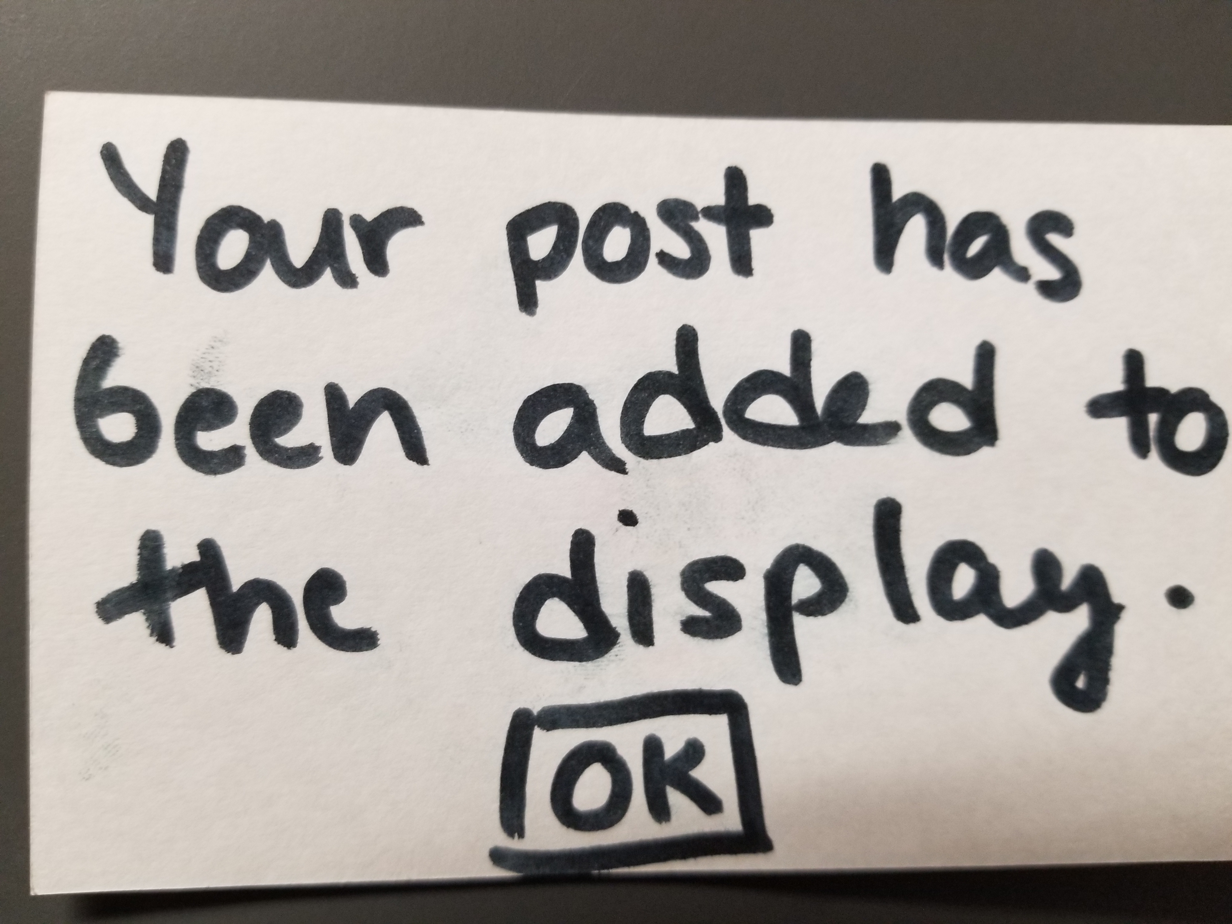
**Flag Content**
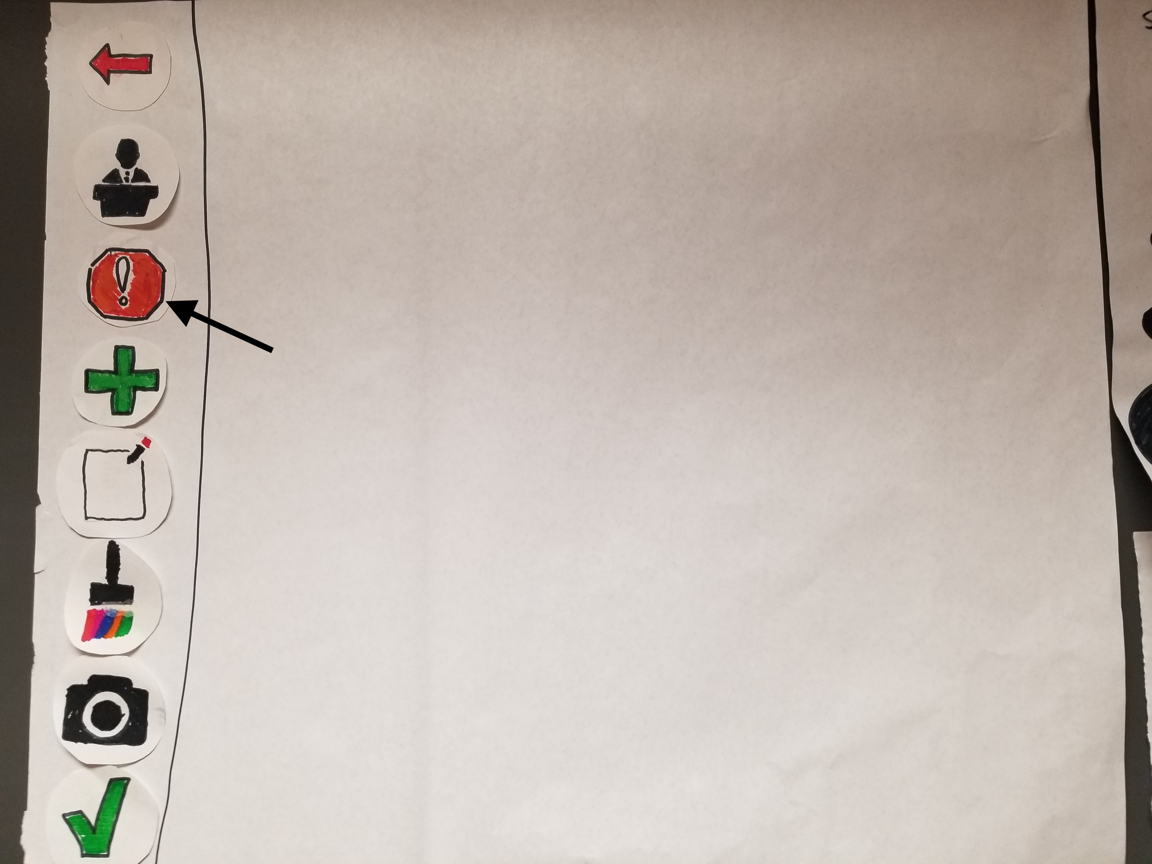
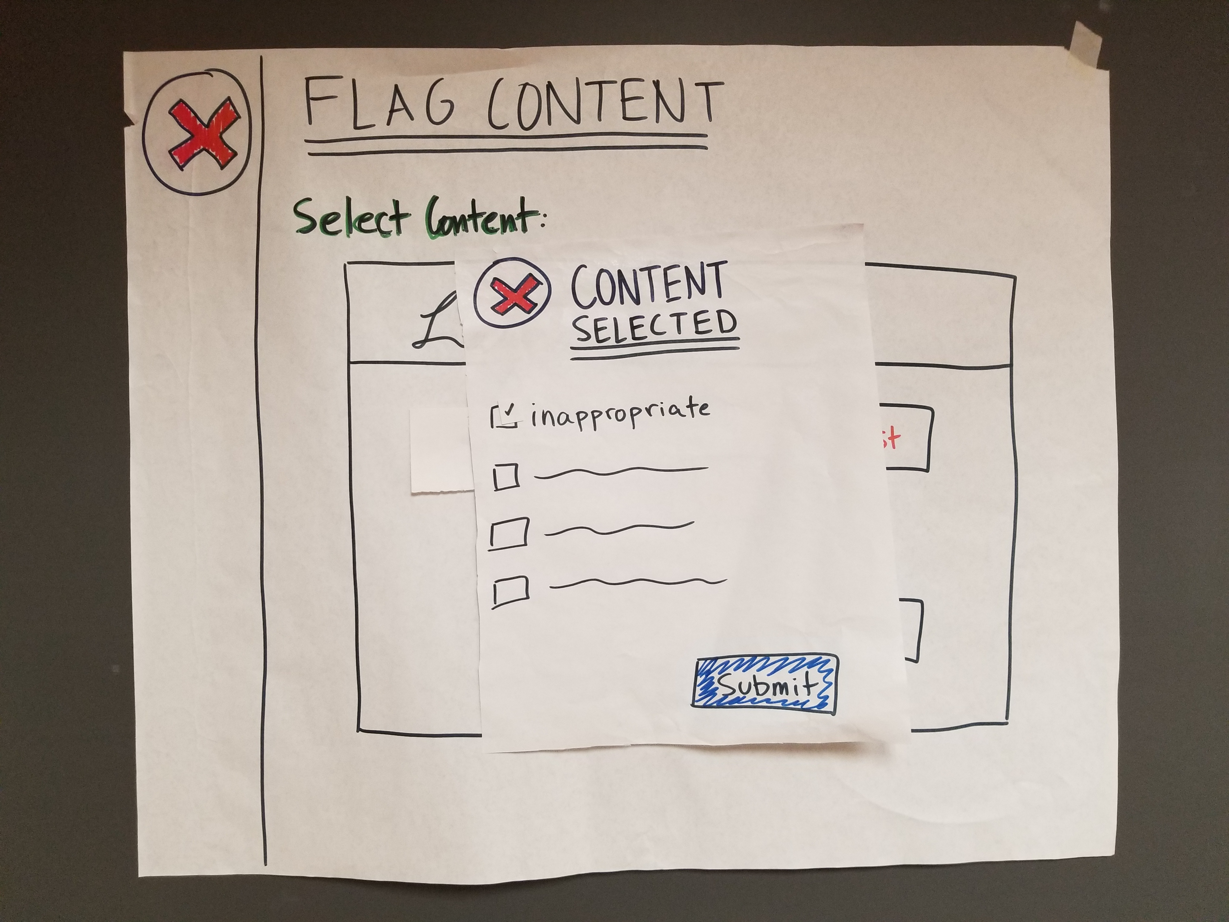
Our Plan Going Forward
Overall, we think that we gained a lot from watching two participants, both of whom know each other, use our design, as this reflects a likely scenario of who would actually use our product. This is not to say, however, that singletons would never also use our design. For this reason, we would be interested in conducting at least one usability test with only a single individual, rather than with a group, to see if that individual would use the product differently than would a group of two or more. Beyond this, we still think it is more likely that a group of people who know each other are more likely to use our product, so our third usability test will, once again, be with a group of users (likely two), to iron out any final issues in our design. Since our first usability test ran smoothly, we plan to keep the roles as they were–– Liv as Computer, Peter as Facilitator, and Teiheim as Notetaker, so that there are no issues on our end and the study can focus on issues with the product. As for new approaches, we plan to set up a camera beforehand to record our users using the design, as opposed to simply recording the voices of our participants, as we had the first time. While it was nice to record their voices, we think it may also be useful to watch them ineract with the product on a physical level as well.