Usability Test Results
Usability Test 1
Our first test featured two individuals who knew each other beforehand. We thought this would be the best method for our first usability test because, before the first test, it is most likley that there will be issues, and we think that any minor issues with a single person’s understanding of the product could be mitigated by the other person, and vice versa. We also think that a group of two, lingering around in a public area, is the most likley group to use our product, as a single person is probably walking outside because they have somewhere to be, but a group of two may be simply strolling around, etc., and decide to stop by and use our product.
Our protocol included first presenting our group with a scenario: they are walking on the street, and out of the corner of their eye, they spot a massive touch screen, projected onto a building, and they are interested in it, so they walk up to it. Beyond this, we let our users walk up to the display and begin interacting with it. We found it fitting to not present to them any goals of what they should be trying to do, because we found this situation more realistic––because this technology would exist, no one would instinctively know to walk up to it and begin posting art. Thus, our test also encompassed ensuring our users are able to self-discover all features of the product.
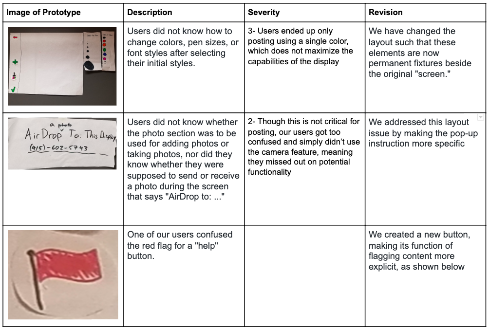
Our Computer was Liv, our Facilitator was Peter, and our Notetaker was Teiheim. Our posters presented a few issues: for one, they didn’t know how to select a different style of paintbrush and font, because these selectors disappeared, so our new design will feature them as permanent elements of the display. Also, the users didn’t know whether “AirDrop to: …” meant they were adding or receiving a photo from their camera roll, so we should make this information more explicit. Lastly, one of our users confused the red flag for a “help” button, so we will create a new button making its function of flagging content more explicit.
The results of our first usability test are summarized below:
Usability Test 2
Our second test also featured two individuals who knew each other beforehand. We thought this was a good strategy because, once again, our users would be more able to co-discover the functionality of the display, and we think that any minor issues with a single person’s understanding of the product could be mitigated by the other person, and vice versa.
Our protocol was also identical to that of our first usability test, first starting with the scenario of stumbling upon the display while walking on the street, spotting the touch screen, and beginning to interact with it. We figured that two usability tests of this nature allow us to fully iron out any issues that may come up when testing using a group of two. As was the case in the first test, our computer was Liv, our Facilitator was Peter, and our Notetaker was Teiheim.
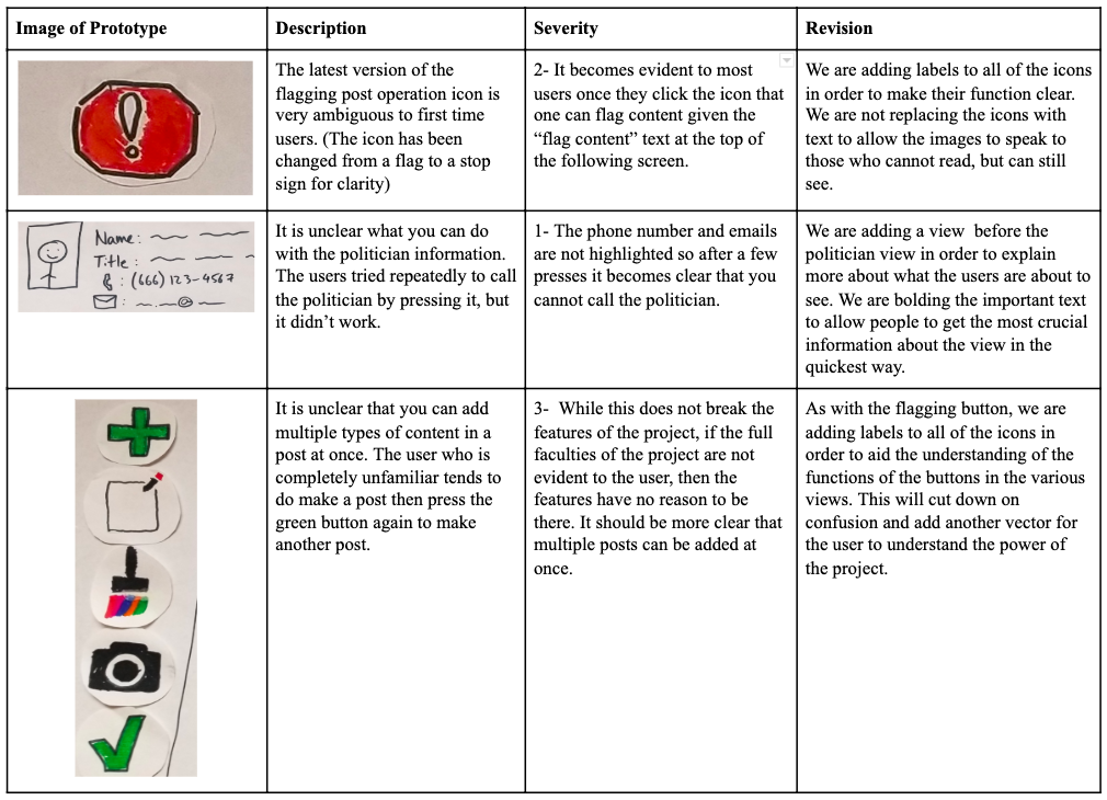
Our first issue was that our new “flag content” icon was still not clear enough for users. We decided to label this button with text to clarify this issue. We also noticed that it was still unclear what users can do with the politician information. We thought that presenting this information in a slightly different view would mitigate the issue, but our third usability test convinced us that this area needed a drastic overhaul, as we will discuss in the next section. Our third issue was a minor one: our users wished all the buttons were labeled with text. We decided to leave our buttons as is for our third usability test because our first group did not have as many issues with our buttons, so we wanted to see which opinion was more common before making the change.
Usability Test 3
Our final usability test was conducted with only a single participant. We decided that it would also be valuable to know how a single person would interact with the display when they did not have another person to aid them. Having the participant speak out their every thought instead of speaking their thoughts to another person seemed far less organic, but a single person did provide more pointed and detailed information as she was narrating their thoughts.
In this last test, Liv was the Computer, Teiheim played the role of facilitator, and Peter played the role of Note-taker. As always, we conducted the test in a relatively open space where the participant can easily move around the space to simulate being outside the most closely, and we prompted our user with the scenario we gave each of the previous groups.
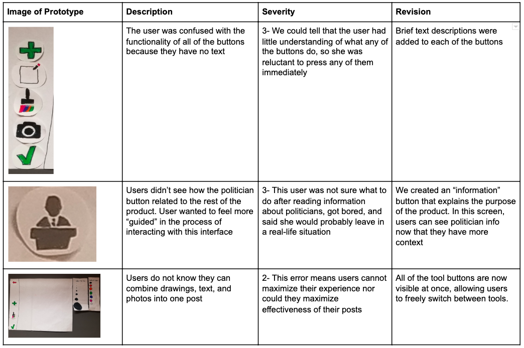
This usability test proved to tip the scales on many of our design choices. Firstly, this user strongly disliked the buttons’ vagueness, so we added text labels to each of them. She was also incredibly confused by the entire purpose of the politician button. She did not see how it fit in with the rest of the design, and after closing out of this section she had no idea how to progress further, so we turned this entire section into an opportunity to create an “introduction” page for those who want it. Now, users can read through a 3-sentence description of the product before being directed to politician information, if they want to see it. The last issue we found was that user still did not know that she can add multiple types of content to a single post. We decided on finally mitigating this by adding text to each button and changing our display so that when a user presses “add content,” all three content types remain available for the entirety of the process.
Final Paper Prototype
Our Most Critical Issues:
A common theme among our most salient modifications was that of optimizing functionality. We felt that each of these issues greatly limited the potential usability of our product by confusing the user into thinking there isn’t any more to do.
Issue 1: Illegible Buttons
Each of our users struggled, to some degree, with understanding the functionality of each button. Though our original goal was to create a design that felt seamless and minimalistic, the result ended up being a confusing display that slowed productivity. Especially because this is not an interface that is already well-integrated into society, we think it’s important that we forego the sleeker design for something that helps guide users through the process. The end result, however, is still something that is fairly minimalistic, as there are only a few buttons with which the users can interact anyways. We hope that implementing this change will make our design something that does not confuse our users as much.
Issue 2: Unintuitive Workflow
Many of our users elected to first press the politician button (as it was near the top of the screen) before pressing any of the buttons that dealt with content. The users felt confused by what they could do with this information; many tried to tap on the phone numbers, email icons, etc., all to no avail. What’s worse, once they figured out they couldn’t do anything else on this display, they thought they were done. We’ve elected to still provide this information, but we wanted to hide it under a brief description of the button’s purpose. Once again, we feel it is more important that users understand what they can do, than it is to have the sleekest possible display. We found this issue especially important because the users’ first impression of functionality affects whether they may proceed to use our product. If the first thing they stumble upon is a bunch of politician information with no context, they may feel that our product is an information dump, feel bored, and leave. We want users to only access this information if it is something that interests them, which is why we’ve hidden it under a new “information” button, allowing the focus of the display to be on creating content.
Issue 3: Adding Multiple Types of Art
Many of our users felt ready to post content after adding only one type of media (only a photo, drawing, or block of text). While it’s possible that the content they posted was all they had intended to post, after discussing with them we realized that there was a different issue: they did not know that different types of content can be mixed onto a single post. We thought this was a significant issue because it means users feel extremely limited in the scope of their posts, and this means that users would use our product without ever exploiting its full functionality. Rather, they would go about posting mediocre content that would not be as effective. For this reason, we have tried to make it very clear that users can mix content types by keeping all three buttons on the navigation bar until users post. No longer will they need to press the “+” every time they wish to add another element. Instead, they can freely switch between content types and post when they are done.
Walkthrough
| Home Screen | 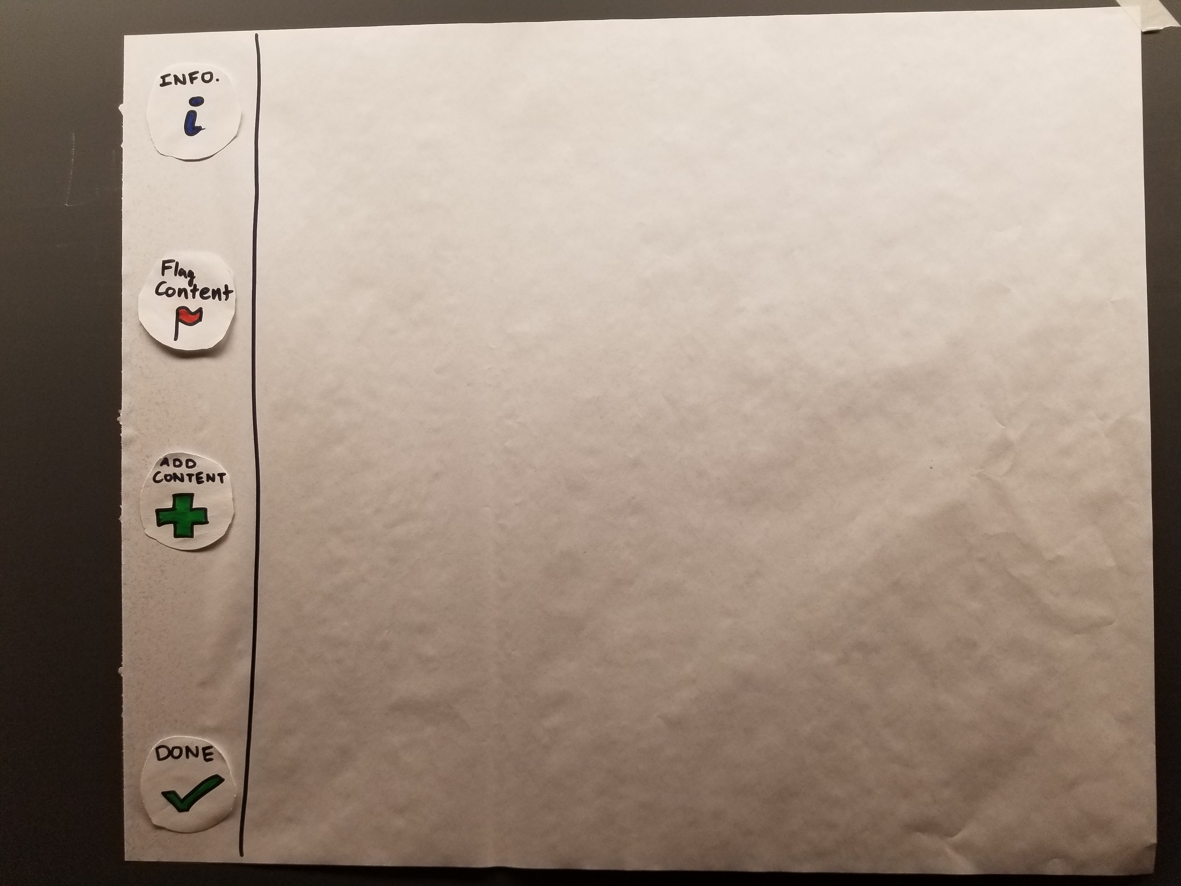 |
| Info Page | 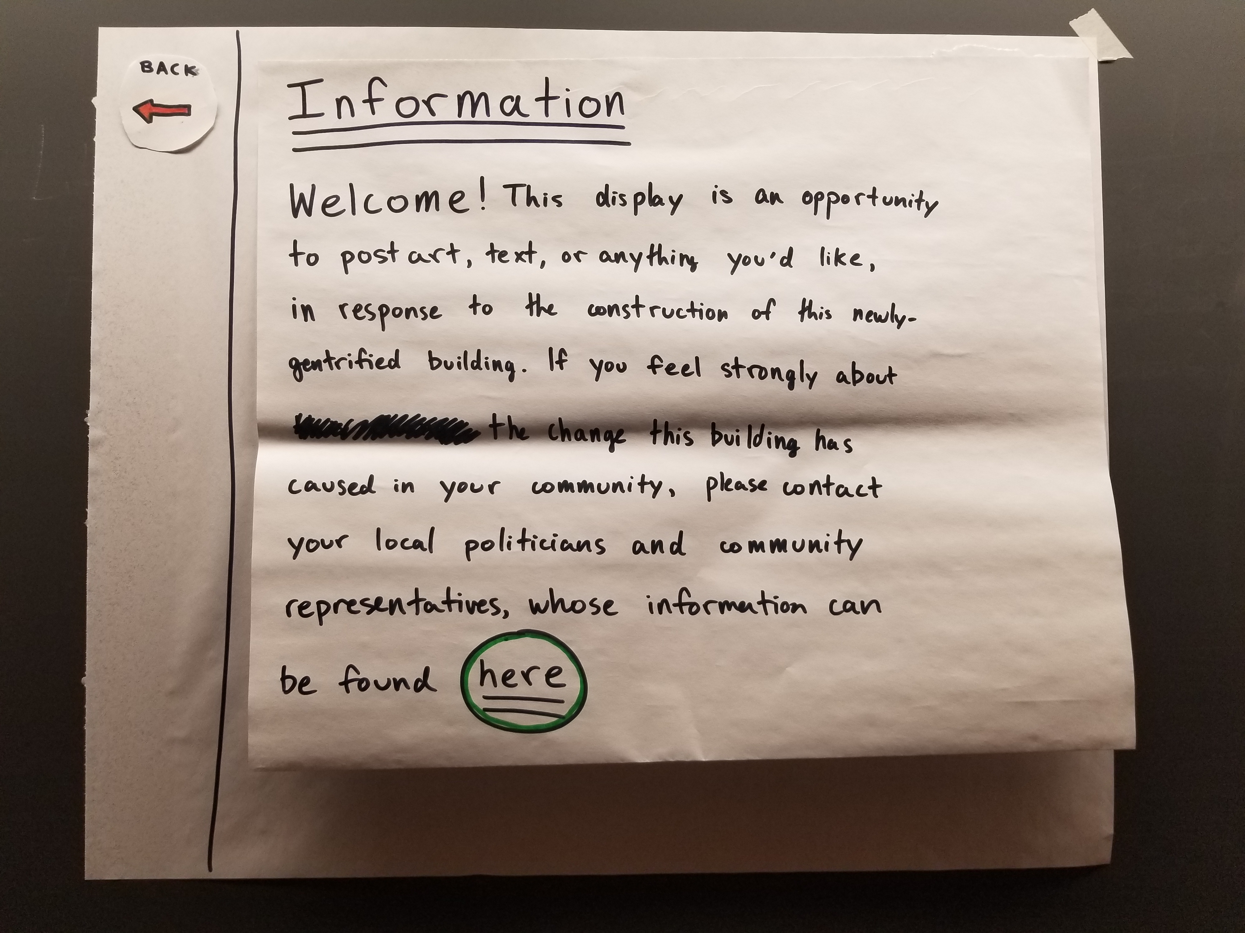 |
| Politician Info | 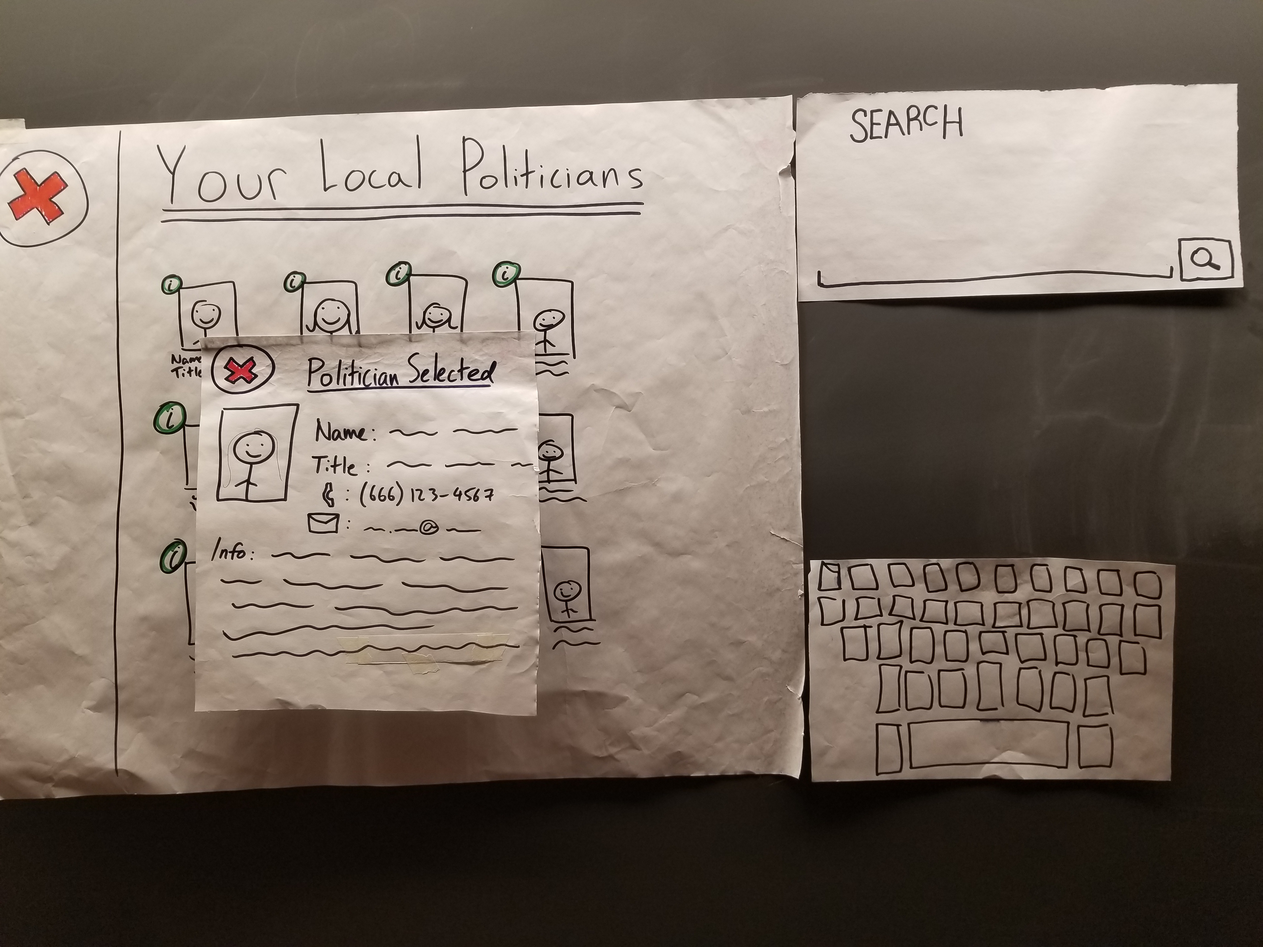 |
| Flag Content | 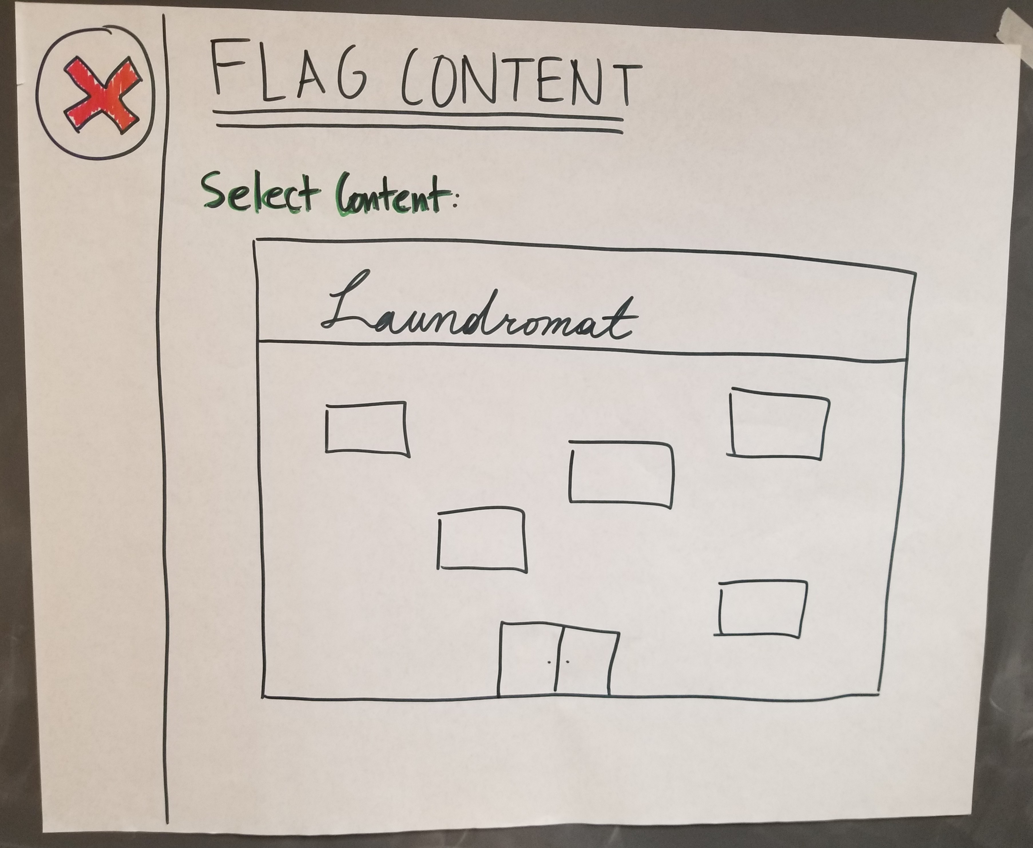 |
| Flag Content | 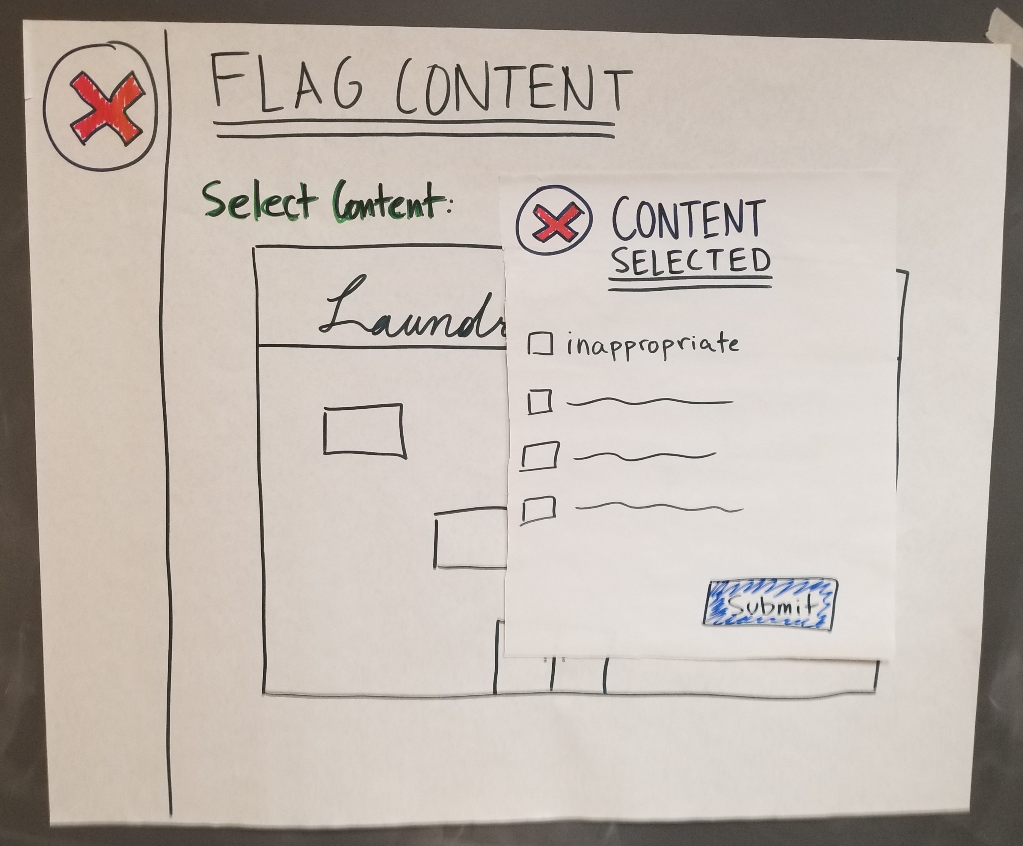 |
| Create New Post | 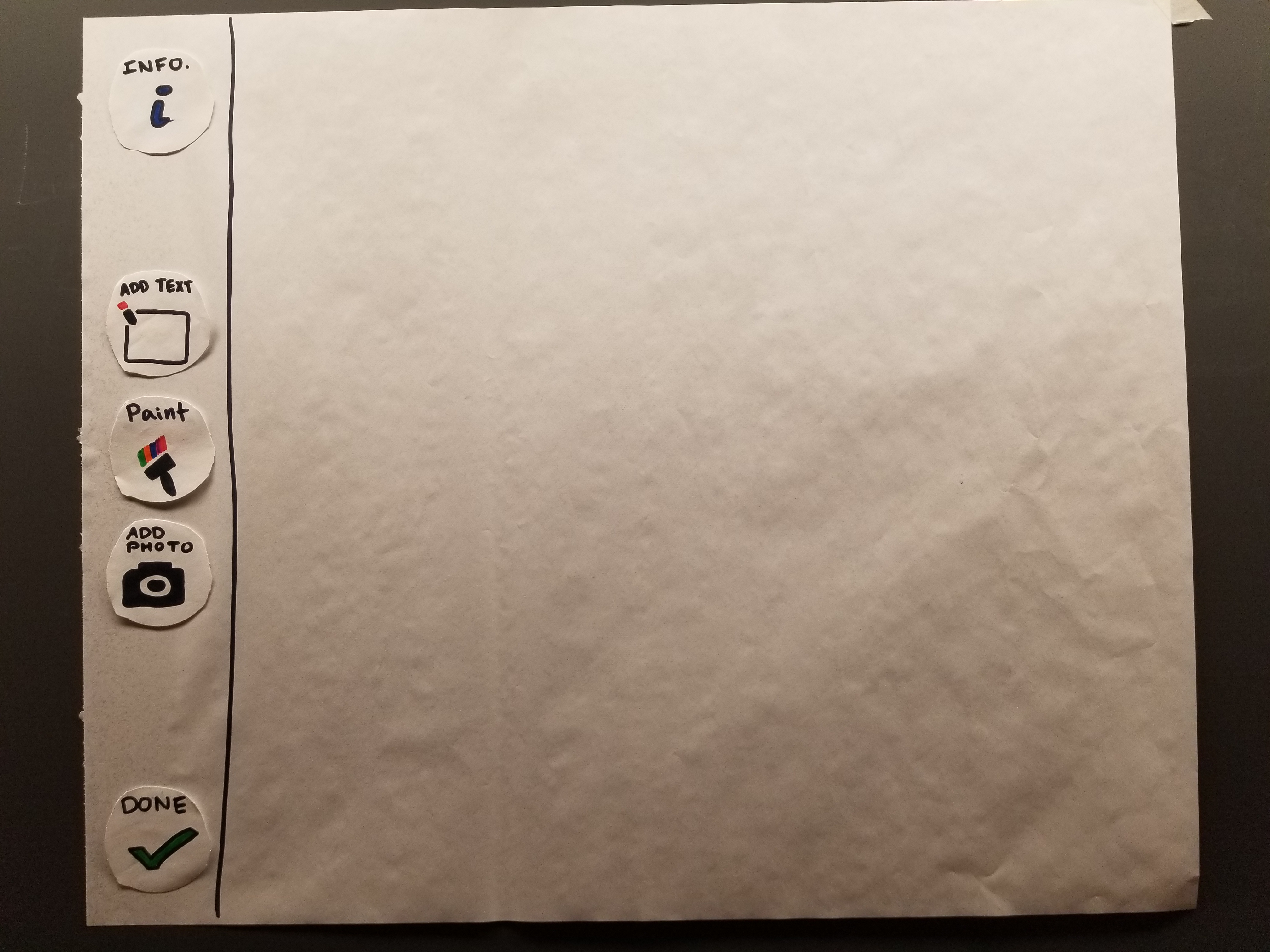 |
| Text Post | 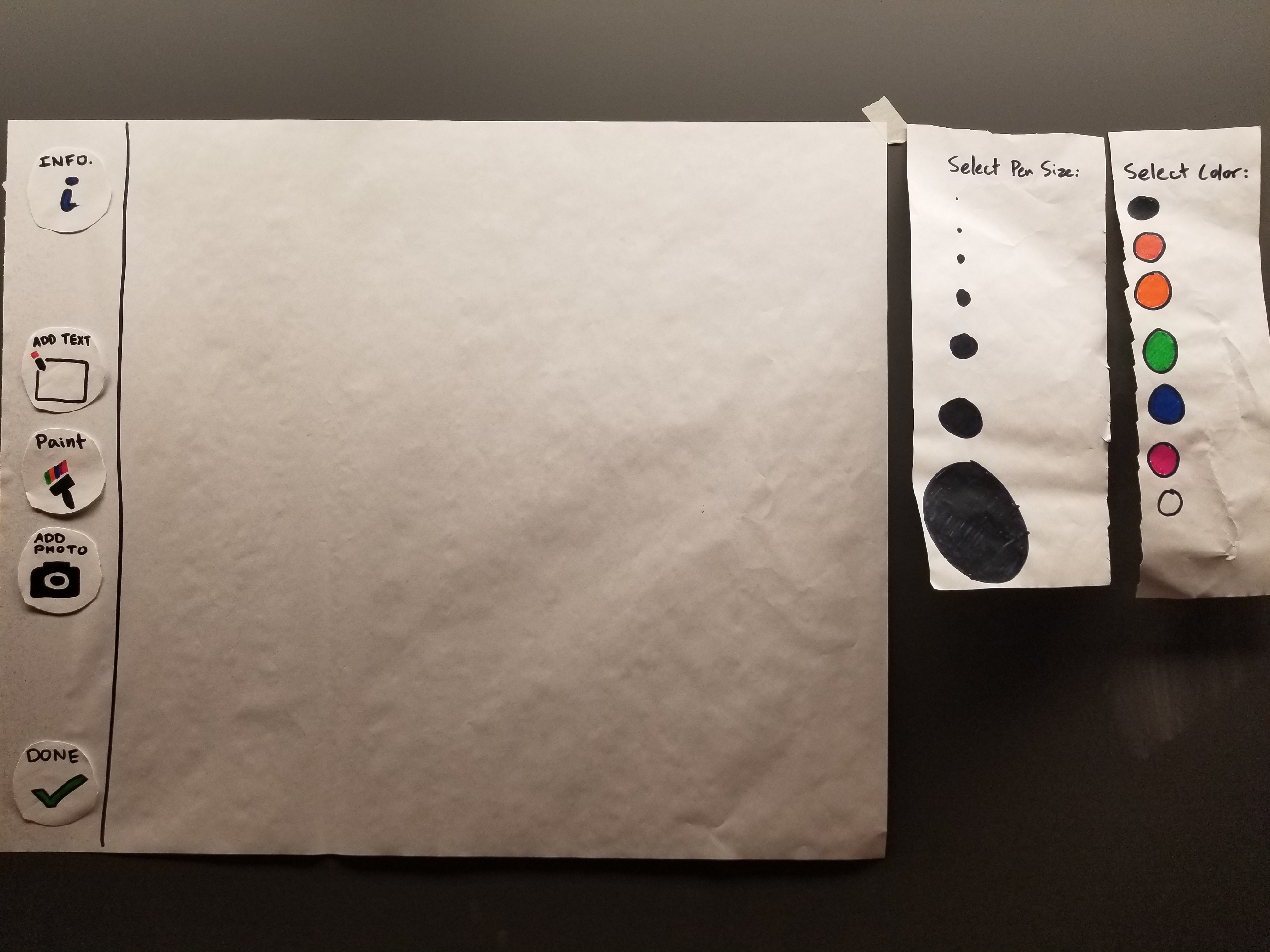 |
| Art Post | 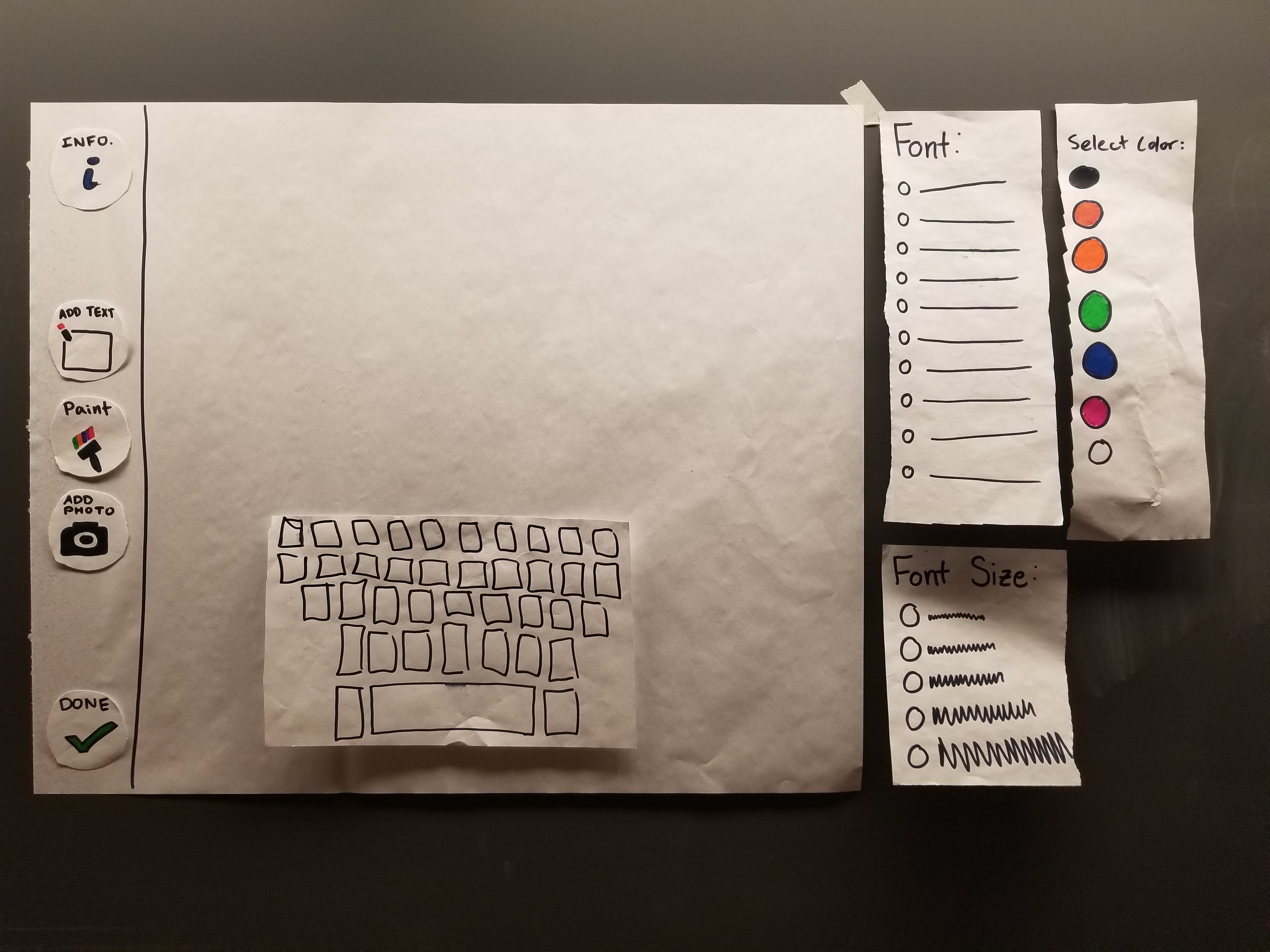 |
| Photo Post |  |