commUnity team:
- Peter Hollander: designer, researcher
- Teiheim Edwards: designer, researcher
- Liv Behrens: designer, researcher
Problem and Solution Overview
While it is natural and even healthy for some communities to evolve, far too often is this evolution to the detriment of the existing community. Nationwide, gentrification sweeps through cities, leaving behind “improved” neighborhoods that lack most of the community that originally resided within. Bristol Live describes the root of gentrification as the ability of higher-income individuals to “become more organised, arranging historic preservation groups, as well as business and neighbourhood associations.” The problem, however, is that the lower-income groups lack the time and resources to arrange in a similar manner, handing over all power and preparation to the wealthy. This also means that lower-income individuals often do not know about these plans until after they have gained momentum, further lowering their opportunity to fight back. For people living in low-income, rent-controlled communities, gentrification means more than loss of local business or the inconvenience of walking an extra block to find a laundromat. In many cases, it can mean drastic increases in rent prices and often eviction, draining the rich communities that may have once existed, putting in their places rich communities filled with Starbucks and shopping malls.
Though gentrification is a nationwide phenomenon affecting many Americans, those affected feel unified only in their feelings of isolation and disempowerment in the wake of their changing neighborhoods. Our design aims to raise awareness of this issue in a disruptive manner. We have selected for our design a large interactive display, to be projected on a gentrified building within an urban community. The design itself will support the task of connecting people to local politicians, as well as the task of geotagging art and other personal ideas to buildings and locations. We have chosen this design because it is by far the most eye-catching, and we believe it is an idea that could prove to be immensely impactful while synergizing the selected tasks. Additionally, it is not something that requires much effort on the part of the gentrified to still create a powerful statement.
Initial Paper Prototype
Overview:
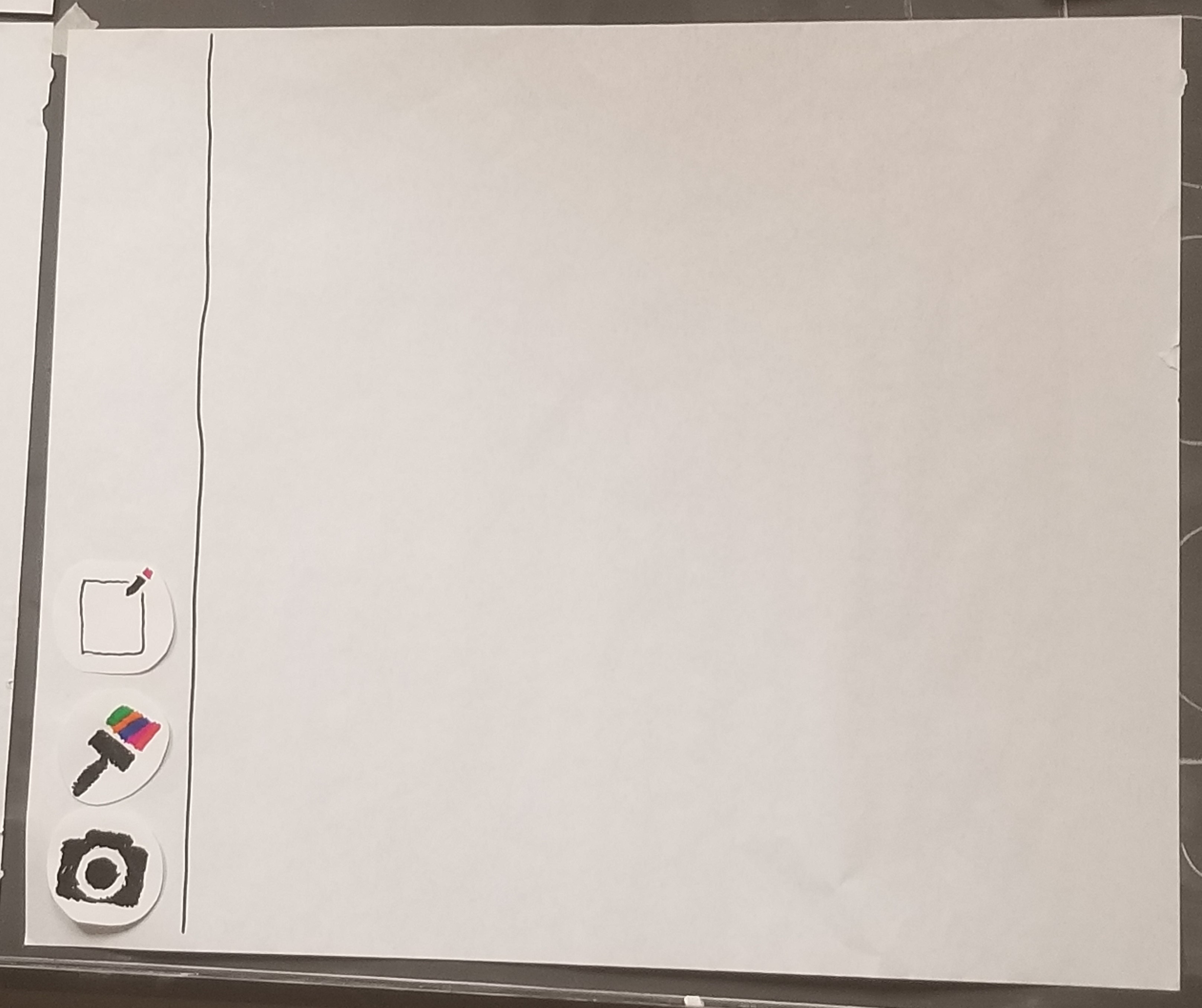
Here is an overview of our entire original paper prototype:
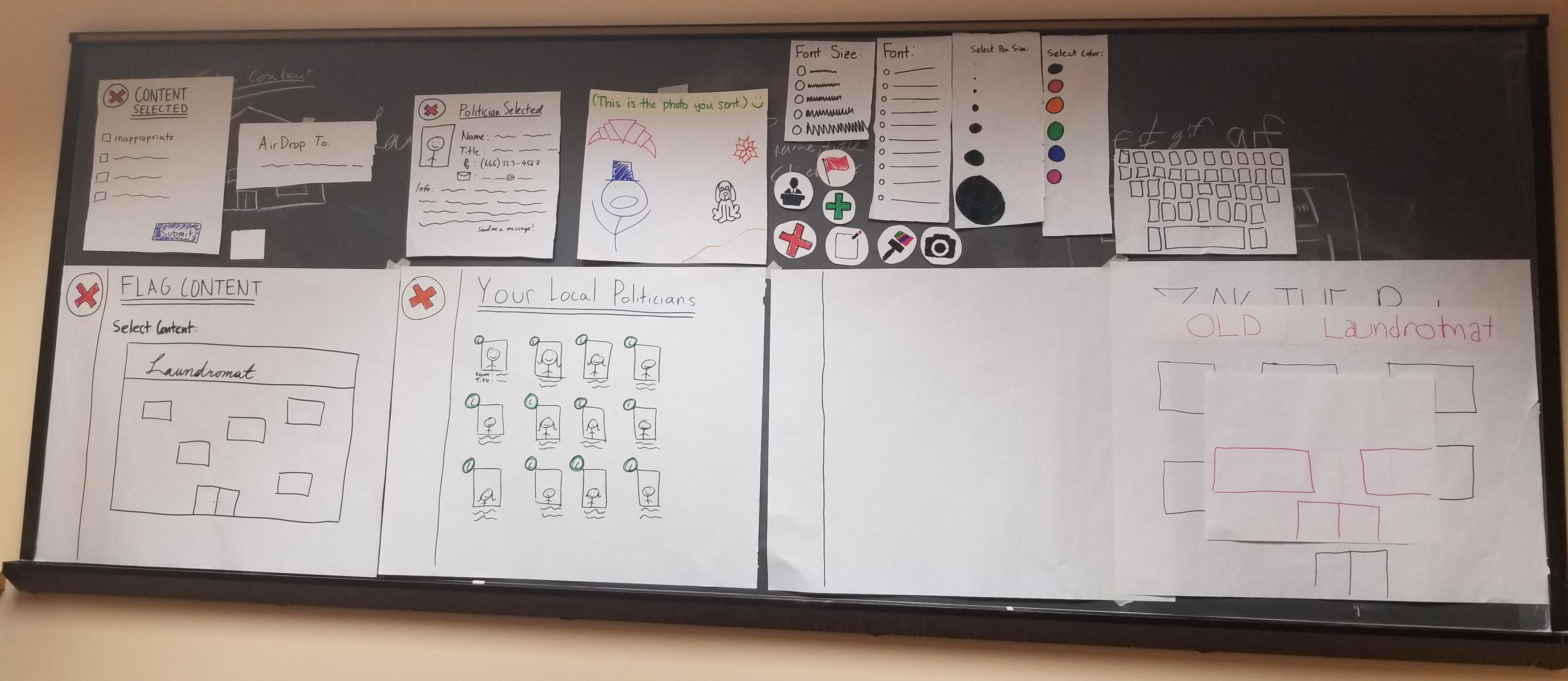
Using the interface:
People walking on the street will notice that a building that has been recently gentrified appears to look like its past self, before the gentrification. They may be intrigued by the various pieces of passionate art that are also shown on this display. Upon walking up to the interface, users understand that the entire interface is a touch screen and are greeted by a sample home screen as shown below. This home screen has a few simple icons depicting what can be done, and each can be touched to learn more about them. Note that this process of beginnging and ending has not changed through our entire design process.
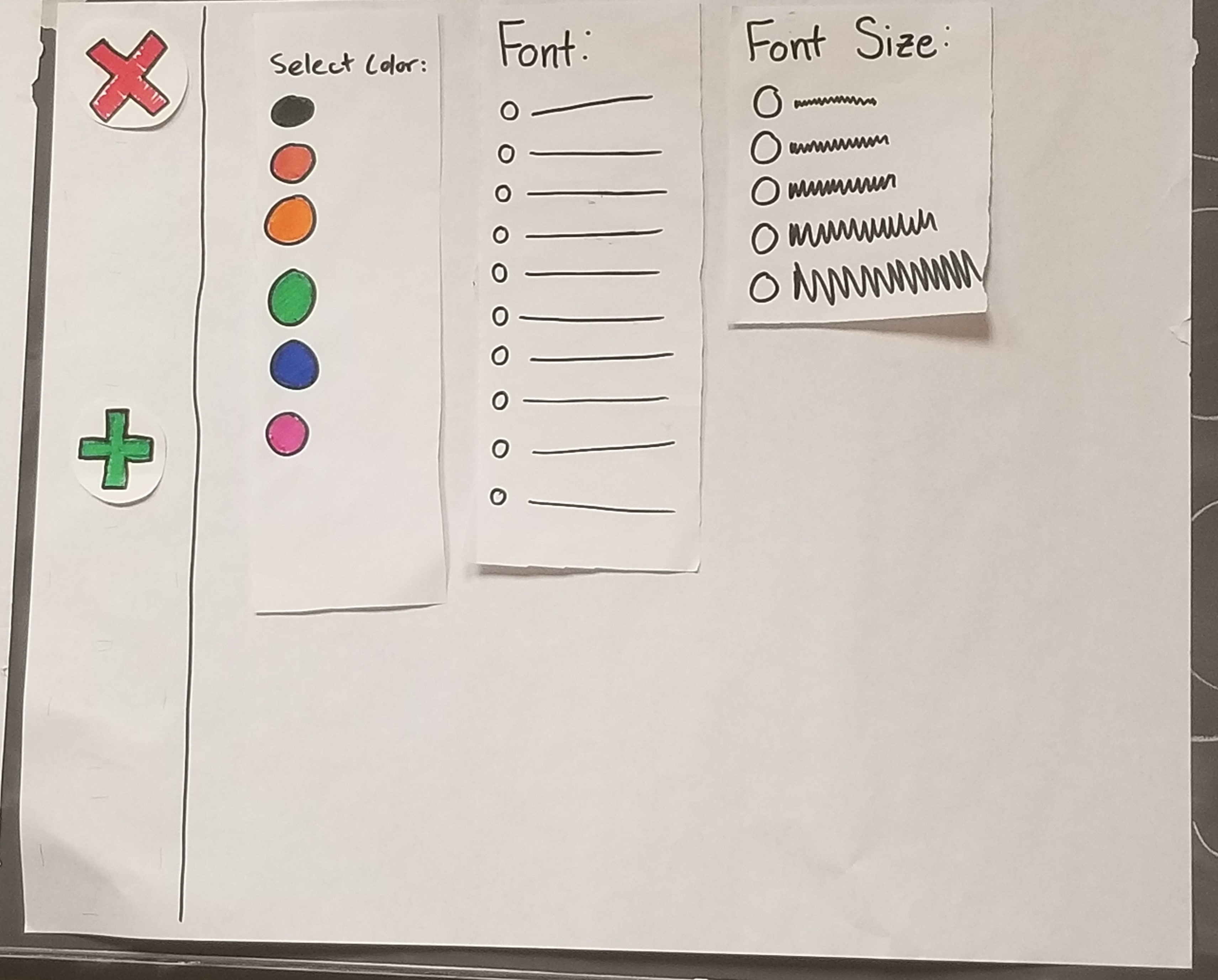
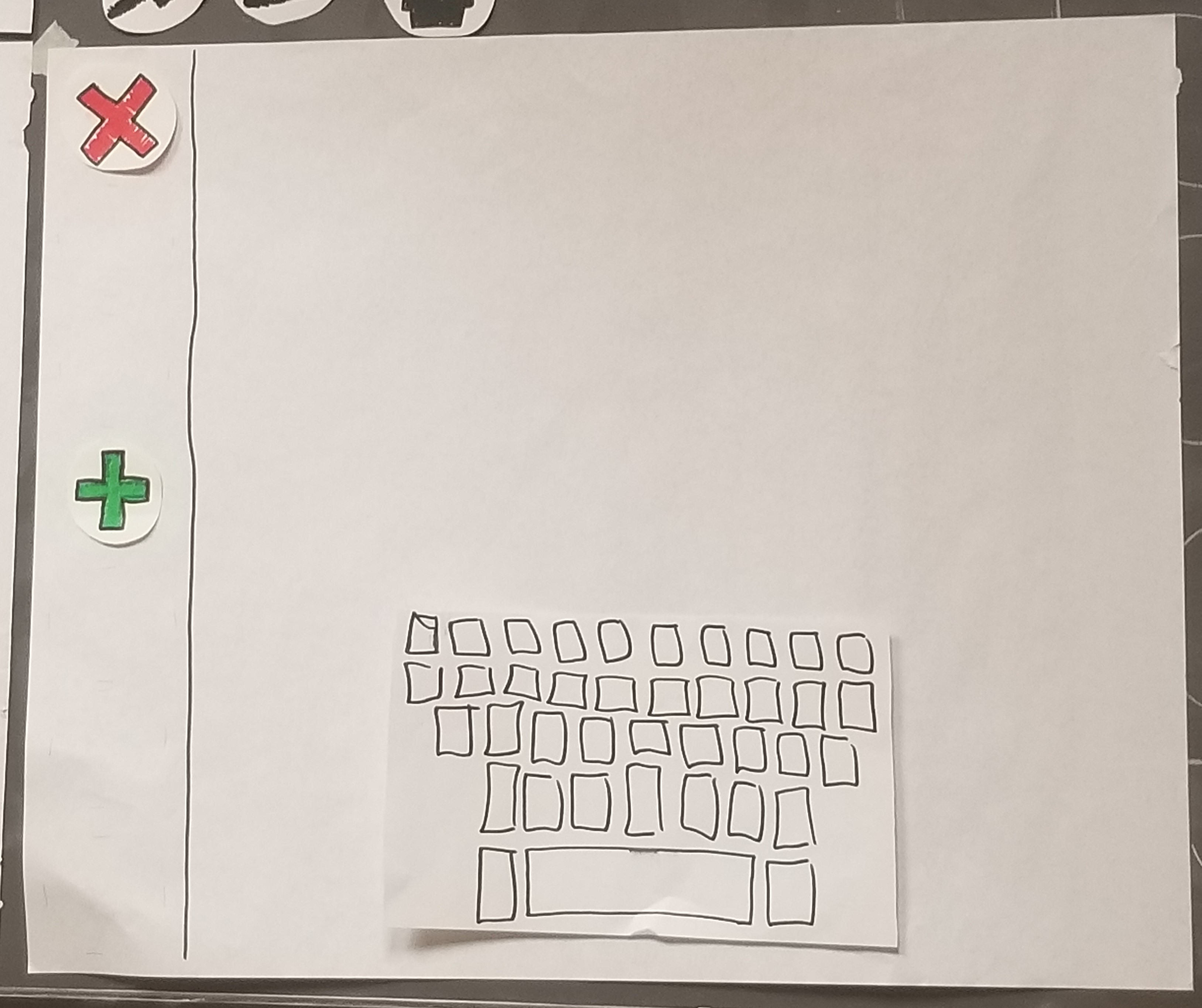
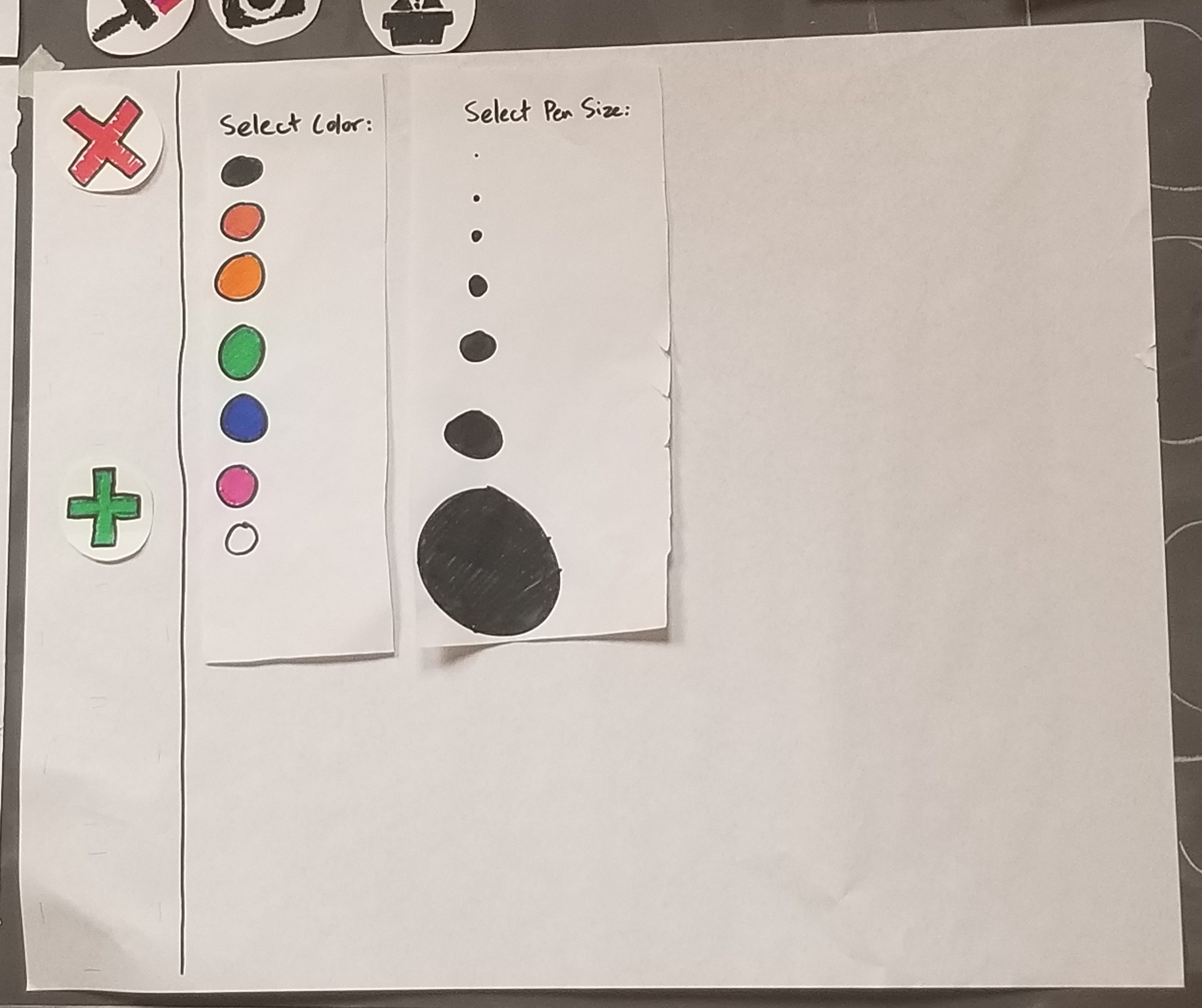
Original Task 1: Geotagging art to the building
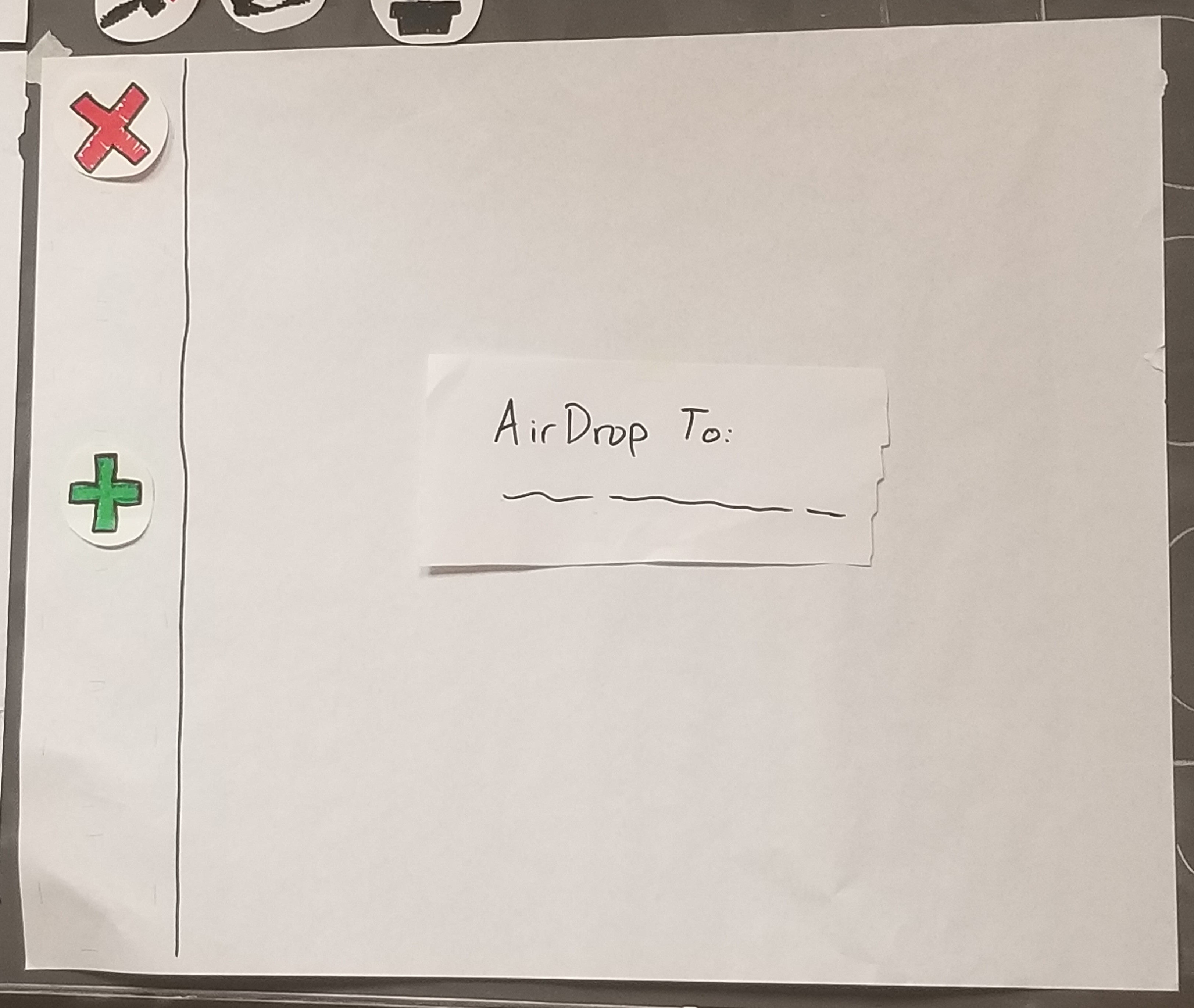
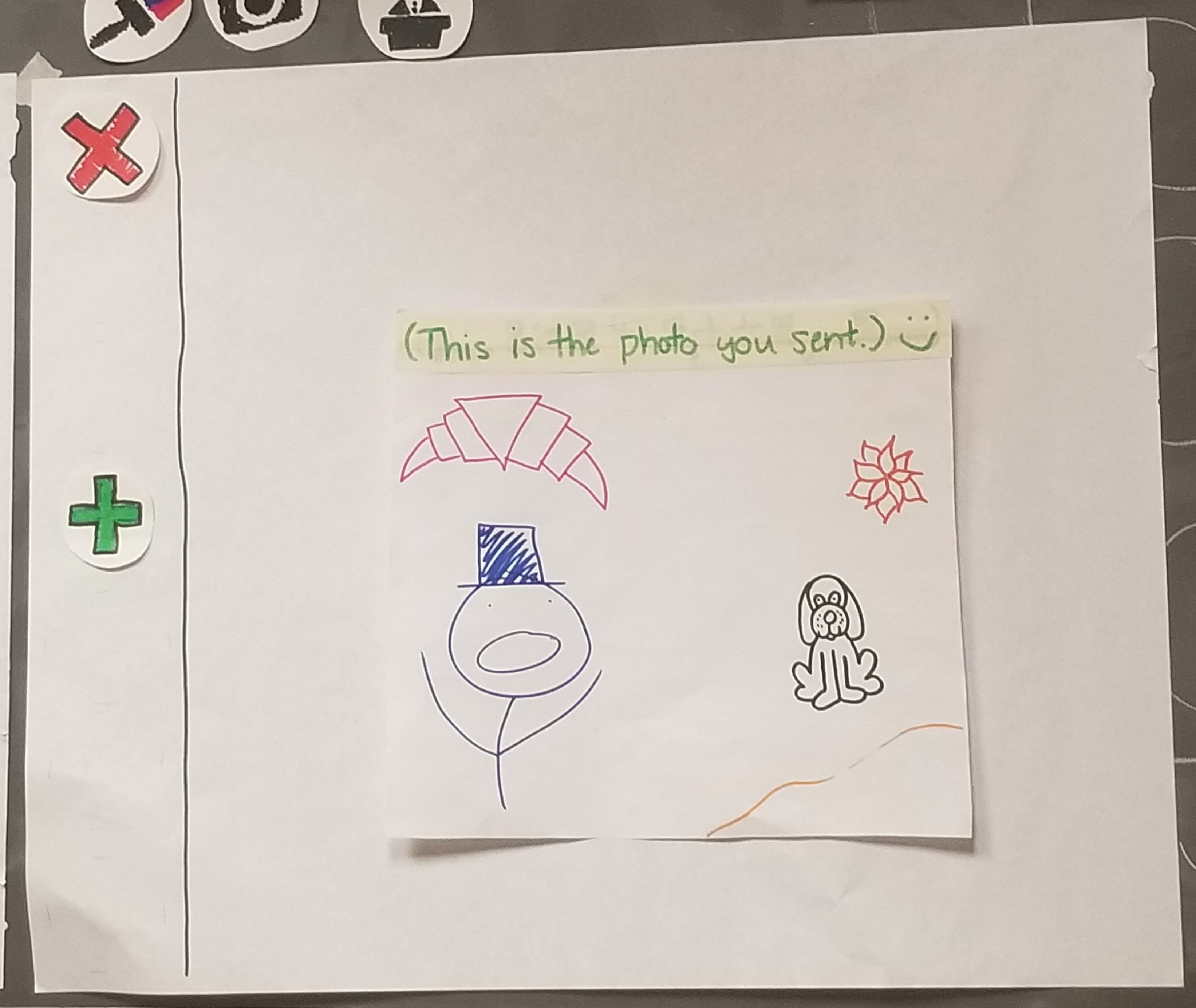
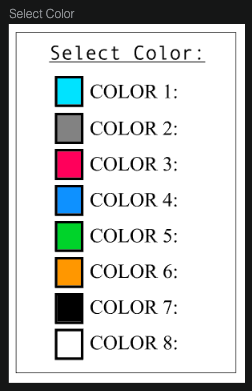
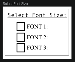
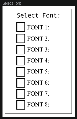
After pressing the green plus sign, users are greeted with options to upload photos to their canvas (via AirDrop or something similar), select colors and draw, and write text. In the write section, users have the option to select text color, font, and size. In the draw section, users have the option to select color and pen size. In the photo section, users have the option to submit their own photos as part of the collage, or as the entire post (as these photos’ sizes can be changed). These can all be combined into one image. Once the user walks away, their image magnifies and self-uploads to the building for all to see.
Original Task 2: Connecting people to local politicans
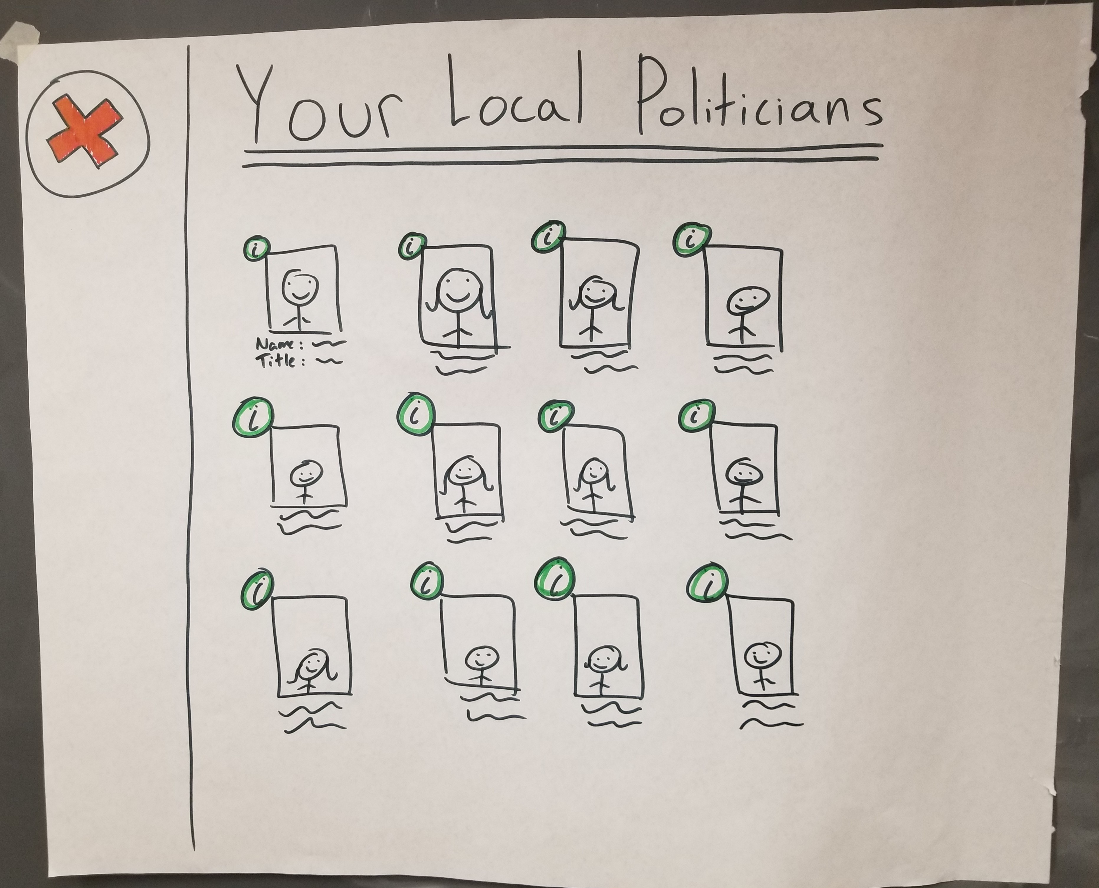
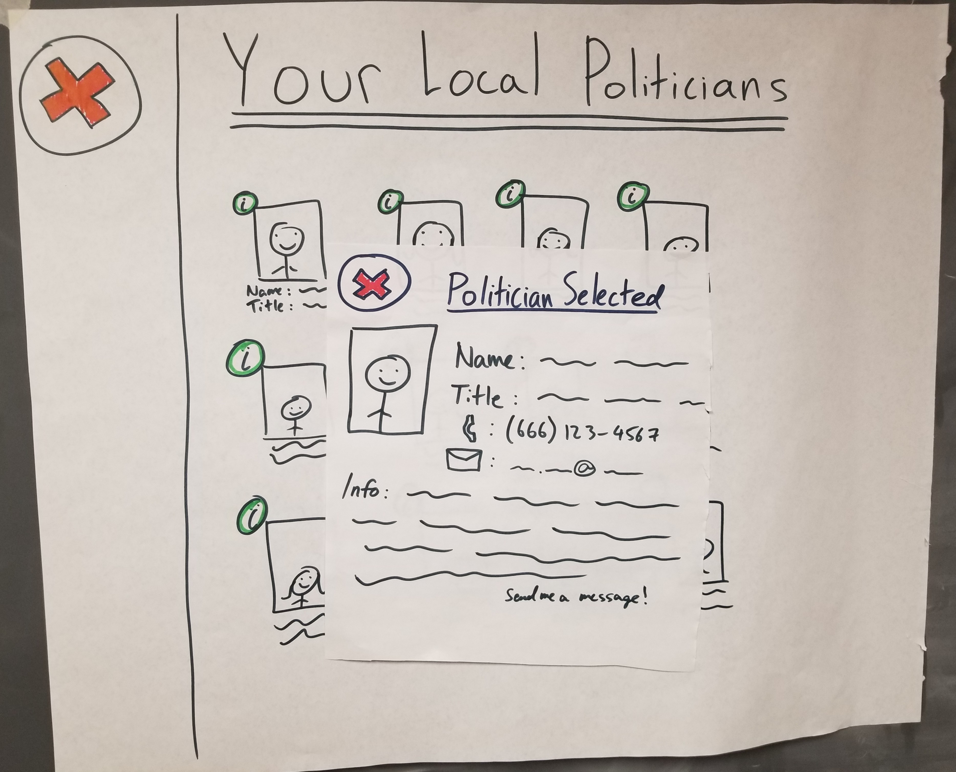
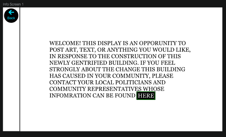
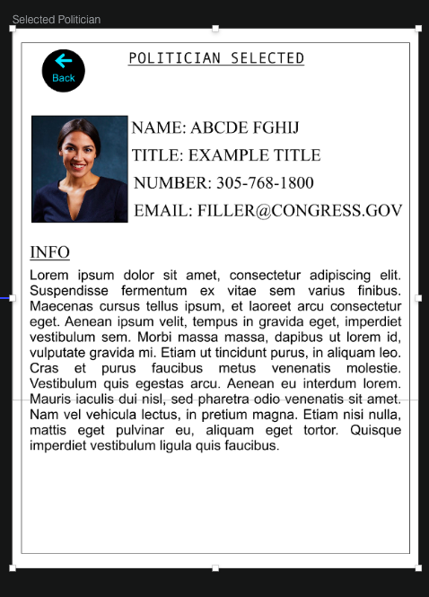
Upon tapping the “politician” icon, users see the array of all of their local politicians. In this screen, users only see the faces, names, and titles of each of these individuals, but pressing the “i” next to any of their images pulls up additional information (phone number, email, etc.). This information is meant for users to contact politicians on their own terms if they feel strongly and wish to speak to them.
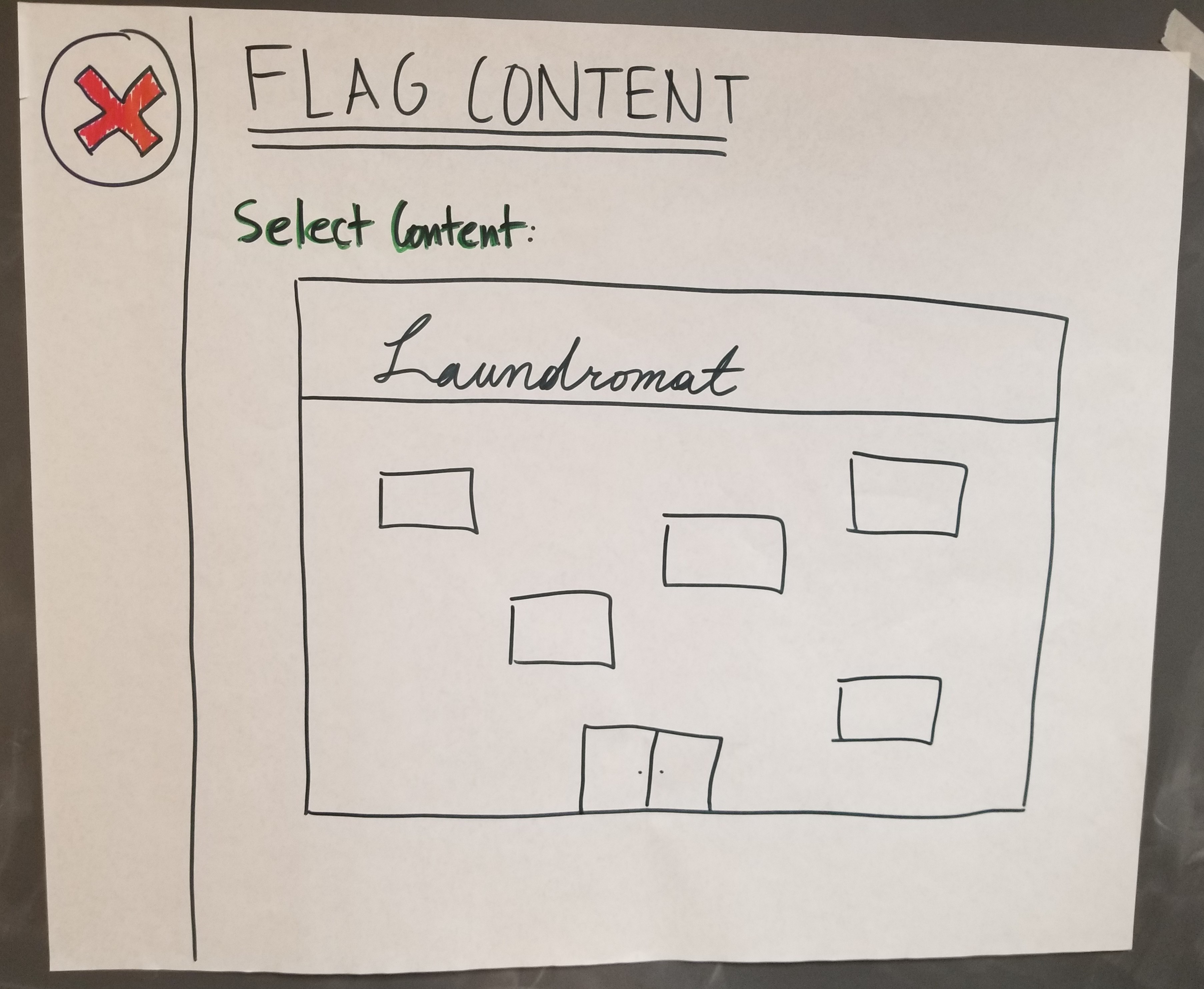
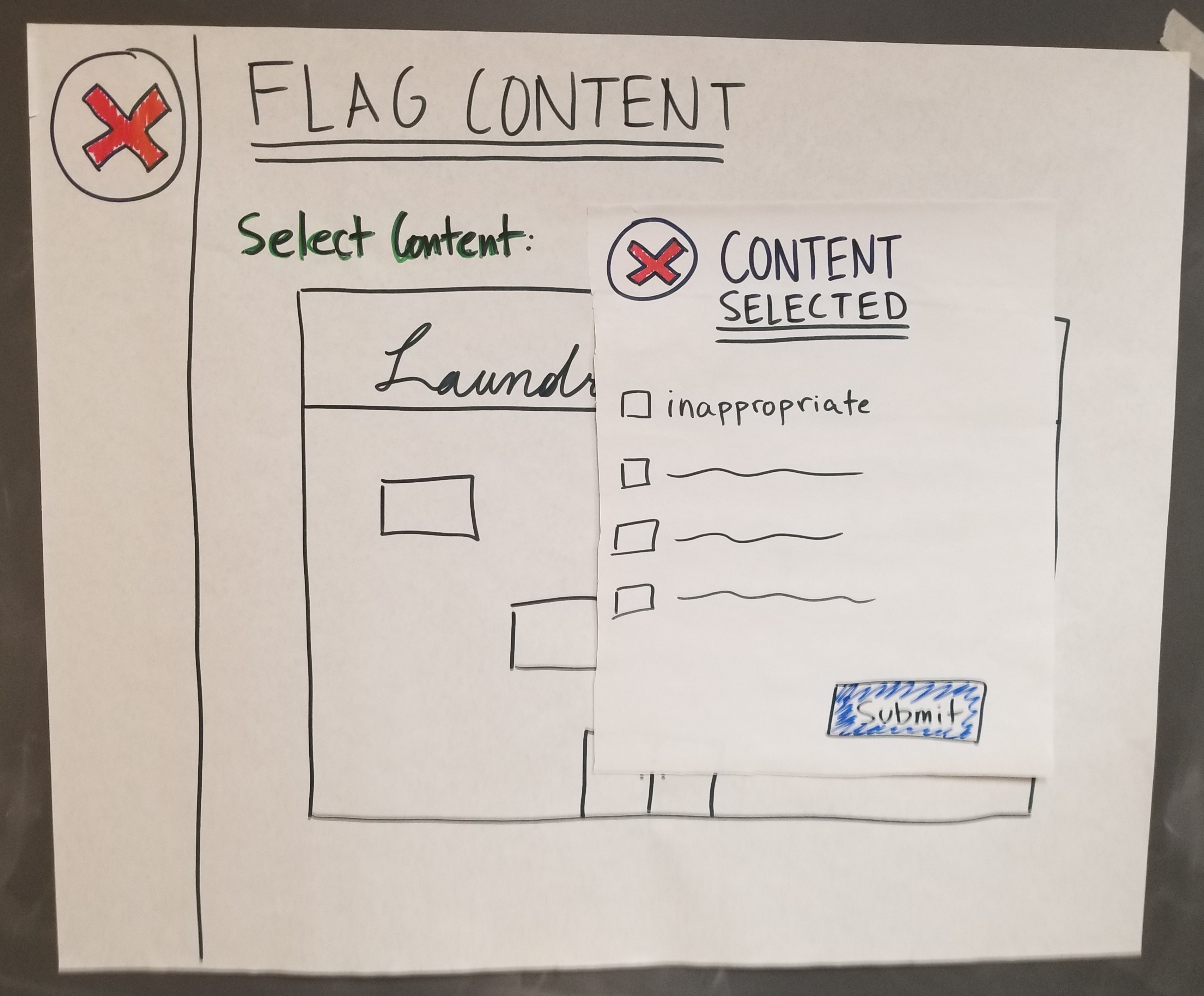
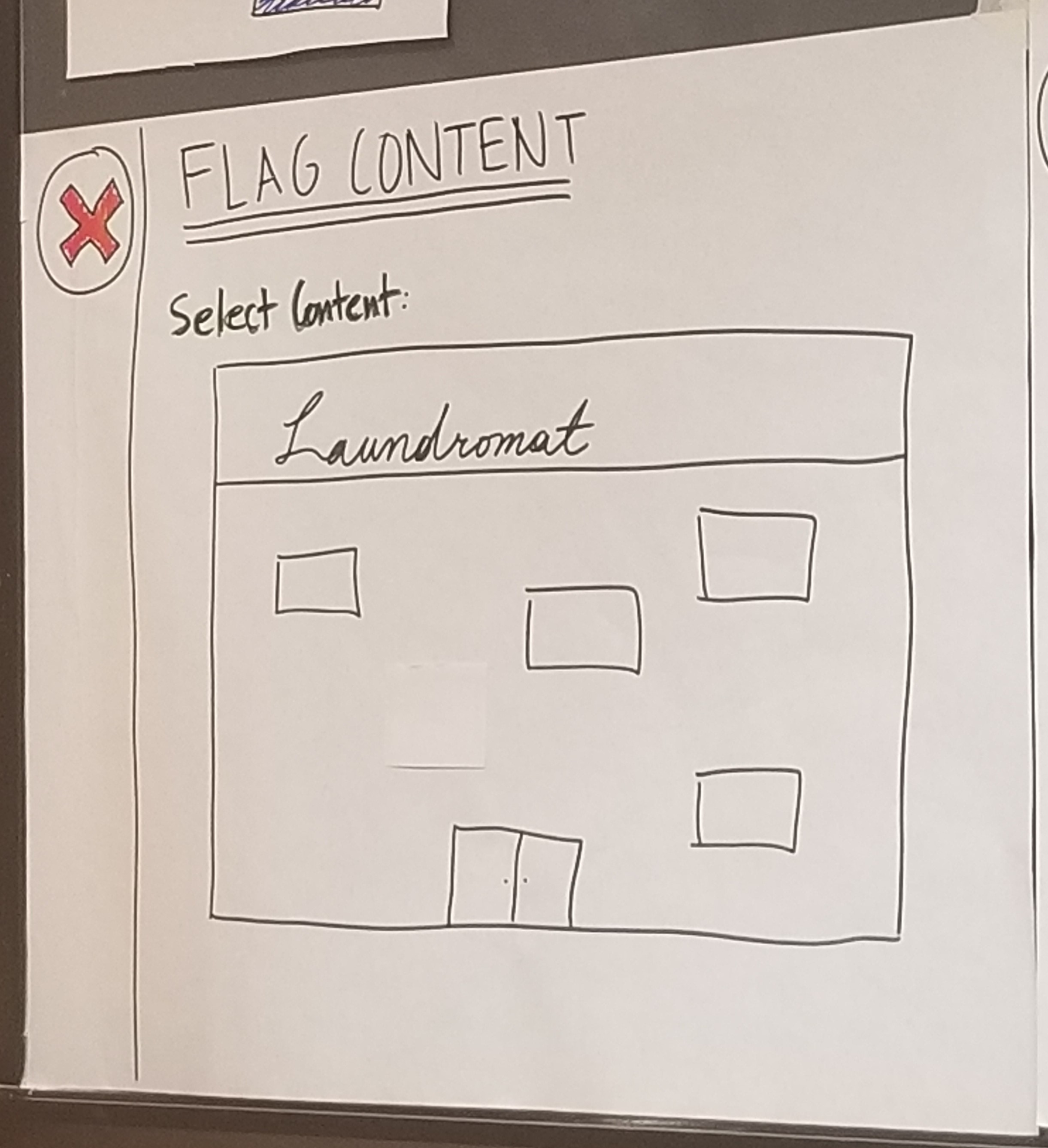
Additional task: flagging others’ content (to prevent hate speech and other bad things)
Users can press the flag, which allows them to select an image and flag it for various reasons. These inputs are processed, and if the request is valid, the post will get removed.
Testing Process
Our first step in the testing process was the heuristic evaluation. We had three participants, one of which was alone, and the other two of which were together in a group of two. For each of these evaluations, 1-2 members of our team walked the users through the product and then allowed each of the individuals to test out the product themselves. We did not give our users specified tasks because we already told them everything our product was capable of doing, so we thought it best to let them explore the interface themselves.
Our usability tests involved two groups of two participants and one single participants, because we wanted to test out the abilities of individuals to figure out how to use our product through co-discovery. Each time, we did not give our participants any specific tasks, because we wanted to mimic a real-world situation where they would simply walk by it on the street and begin interacting, probably having never used it before. Throughout our testing process, we each improved upon our roles. Our notes became more and more nuanced, the computer’s accuracy and consistency improved, and the facilitator improved at striking a balance between guiding the users enough and not giving them too many hints. We strove to provide a strong situational setup, given the non-realism of our design, to make users feel more like they were using a real product, rather than testing a hypothetical design that could never exist. We found that these efforts allowed the quality of criticism and discovery to improve drastically.
We also conducted a cognitive walkthrough as part of our testing process, and we did this after our first usability test. Our cognitive walkthrough did not prove to provide much useful information, possibly because our heuristic evaluations provided us with a lot of information and allowed us to implement many changes. More information on our cognitive walkthrough can also be found on the page describing our usability tests in more detail.
Testing Results
From our heuristic evaluation, we received many critiques that were implemented immediately before our usability tests. The first large critique was that users did not know the status of their art, so we added pop-ups to notify users when their art was posted or discarded. We also switched our red “X” button to a “back” arrow, to make that button’s function more clear.
The main takeaway from the cognitive walkthrough was the addition of the “search” feature within out politician screen; we thought it made a lot of sense, since users who want information on politicians may very well have one in mind already, so this allows them to more easily find the person they are looking for.
As for our usability testing, there were many contentious elements of our design. Some of our users found them very intuitive, while some did not. A good example of such an element were the buttons of our prototype, which did not have lablels at first. In the end, we decided to label each of our buttons with text to make the buttons more clear, because we figured that doing so would not detract from the experience of the users who did not need the text, but it would make the design more intuitive to others. We also expanded the screen layout of our design. Because we have virtually infinite room, we pushed the tool bars to the outside of the original “screen,” to both make room and so that users would not forget that they have the option to change colors, fonts, text size, etc. This has the added benefit of reminding users that posts can have multiple different types of media combined into a single post. Lastly, we hid our “politician” feature a bit more, because we received feedback that the feature did not appear to complement the “post” feature very well. Our new design featured an “information” button instead, inside of which users can still read about politician information, but only once they are more informed on the purpose of our product.
All of our results can be read about in detail here.
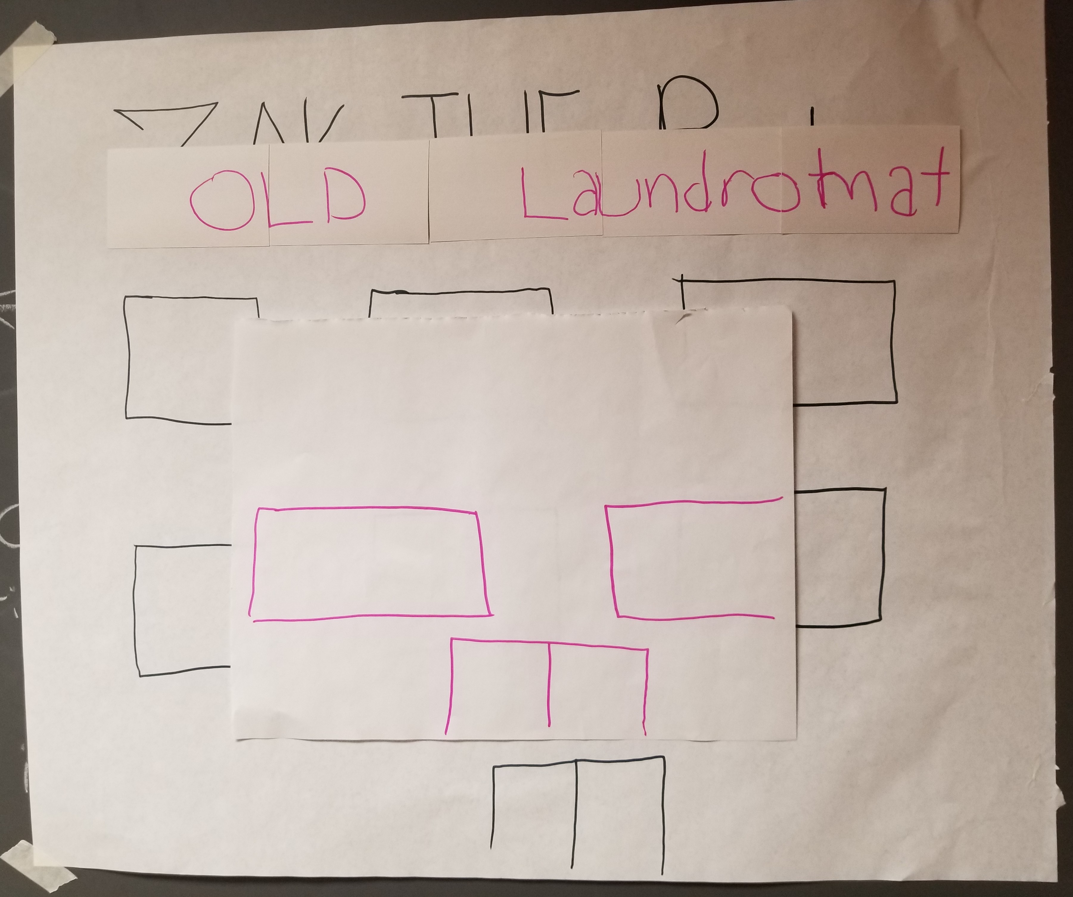
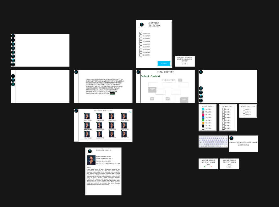
Final Paper Prototype
Our final paper prototype, which implemented all of these changes, is depicted below. In this walkthrough, we see a user going first through the information screens, seeing the politician info, then to the content creation page, and lastly the pop-up showing posted content. This design implements all of the alterations necessary to resolve each of our findings from the testing process.
| Screen | Image |
|---|---|
| Home Screen |  |
| Info Page | 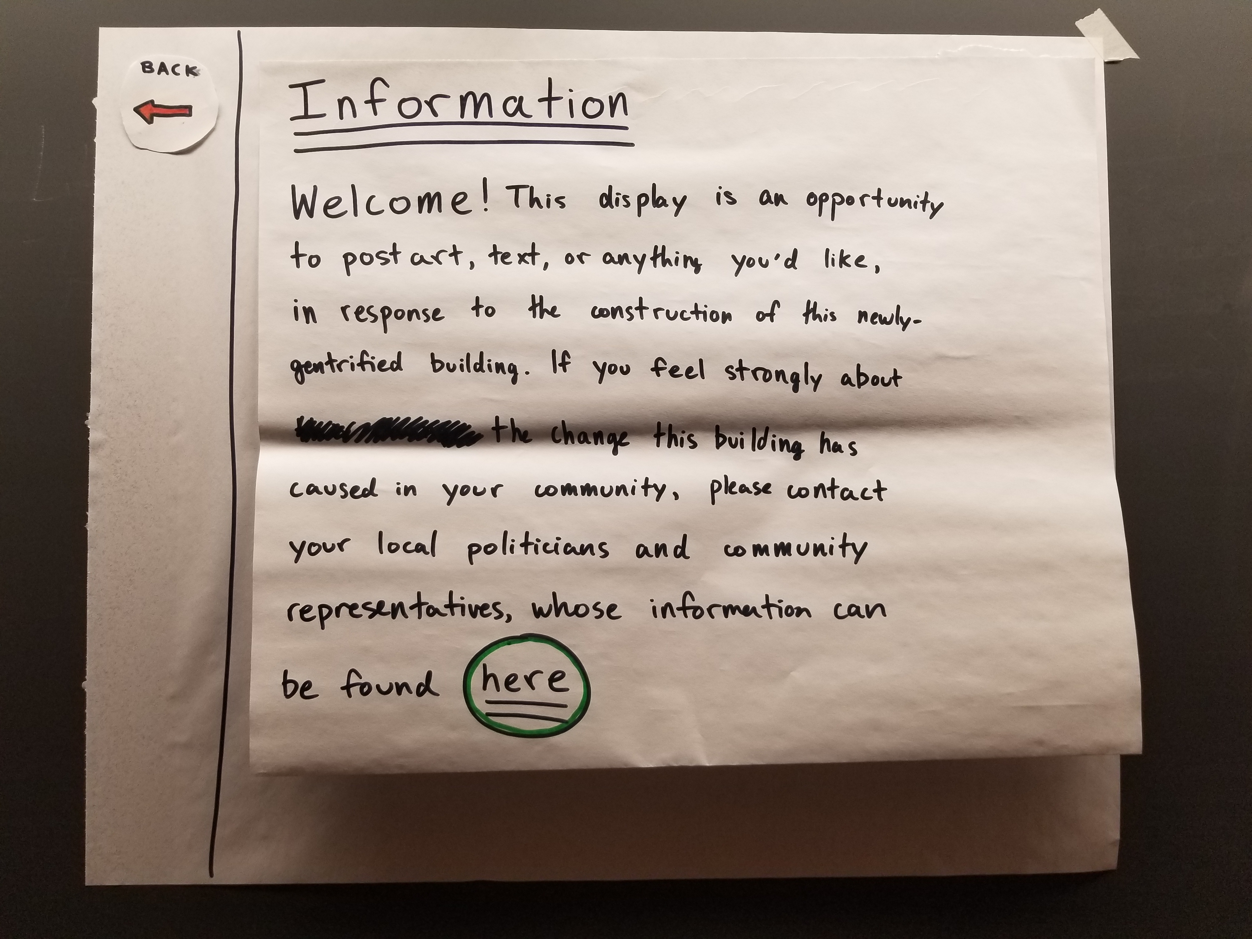 |
| Politician Info | 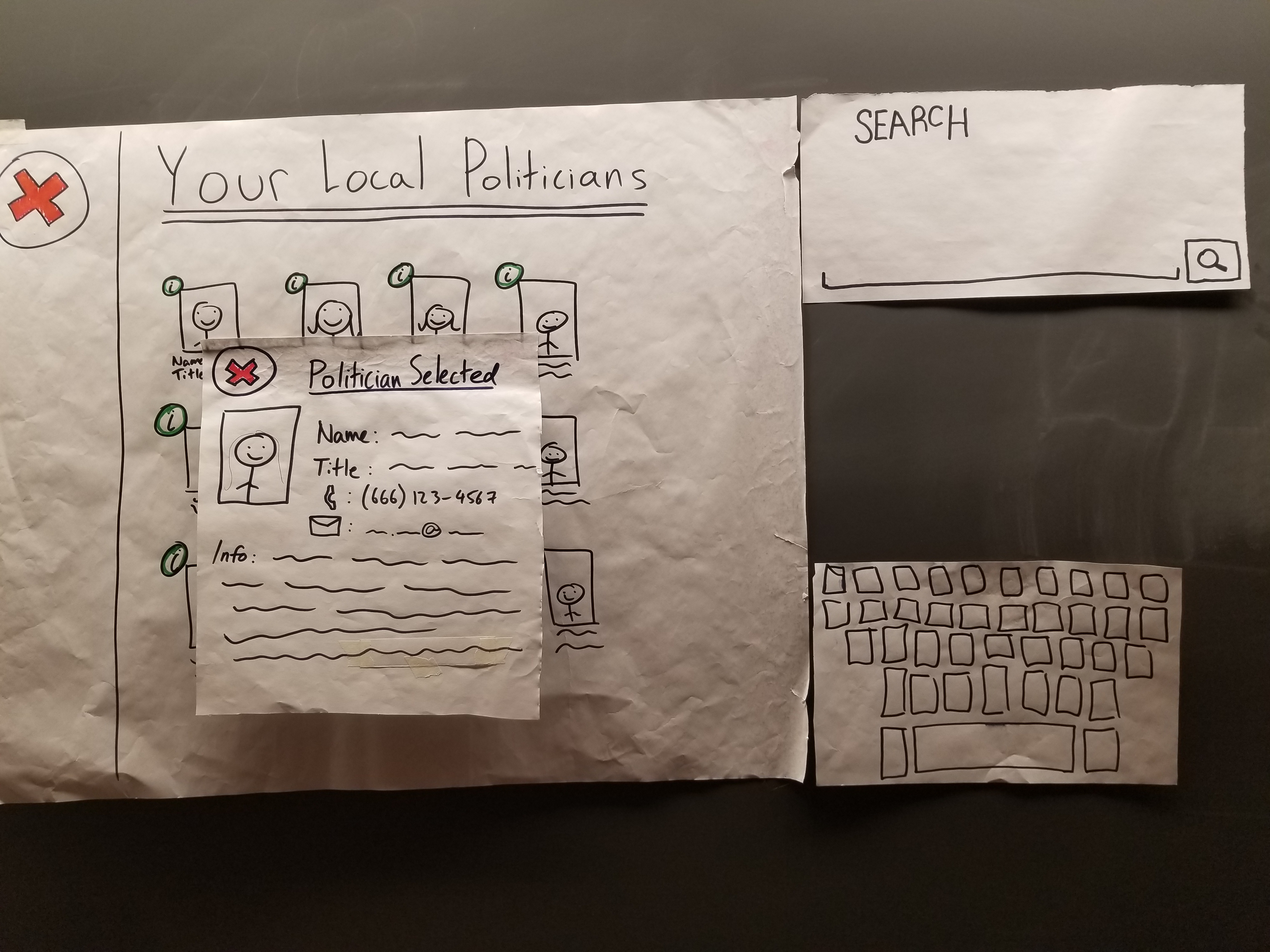 |
| Flag Content | |
| Flag Content | |
| Create New Post | 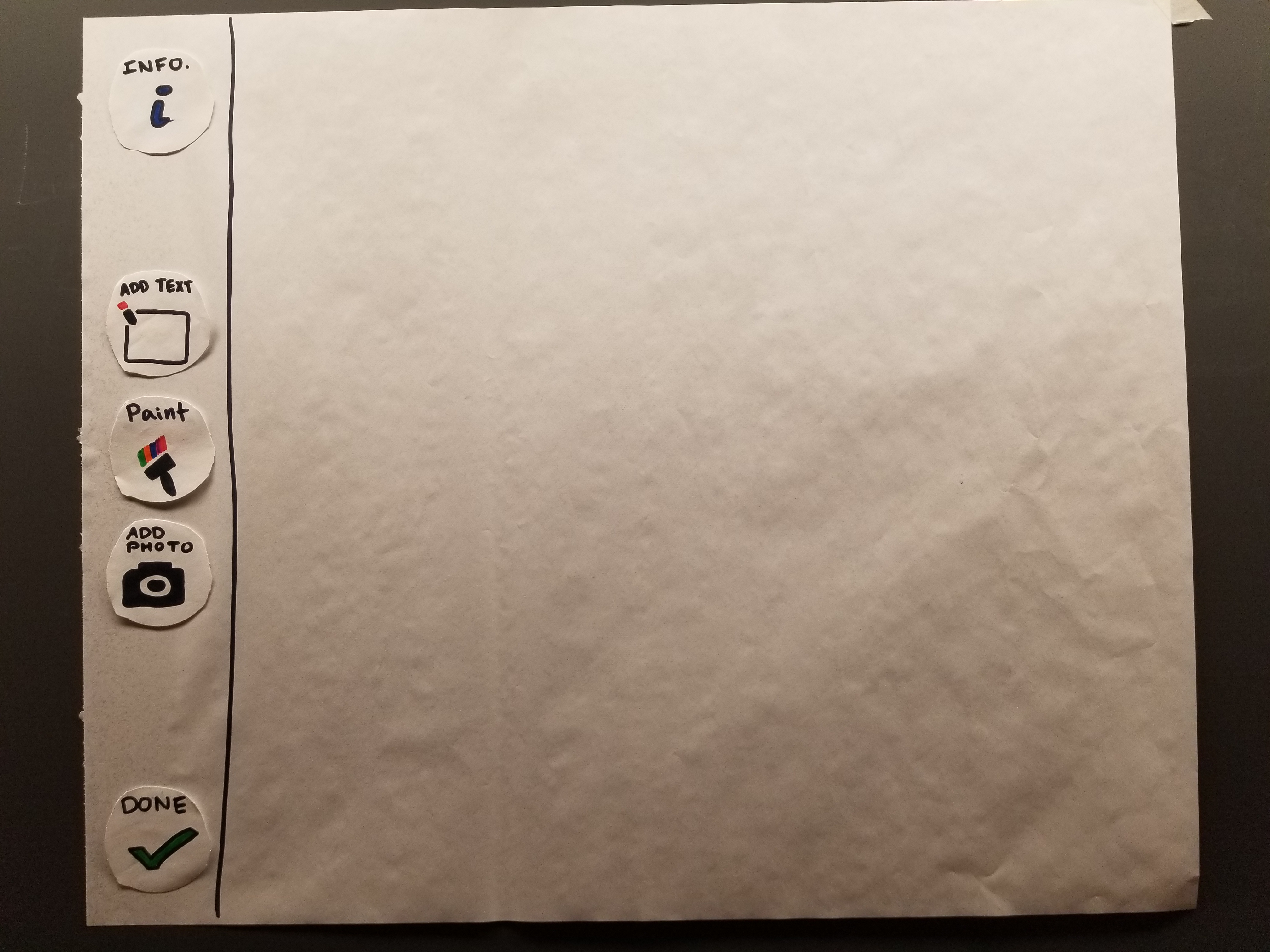 |
| Text Post | 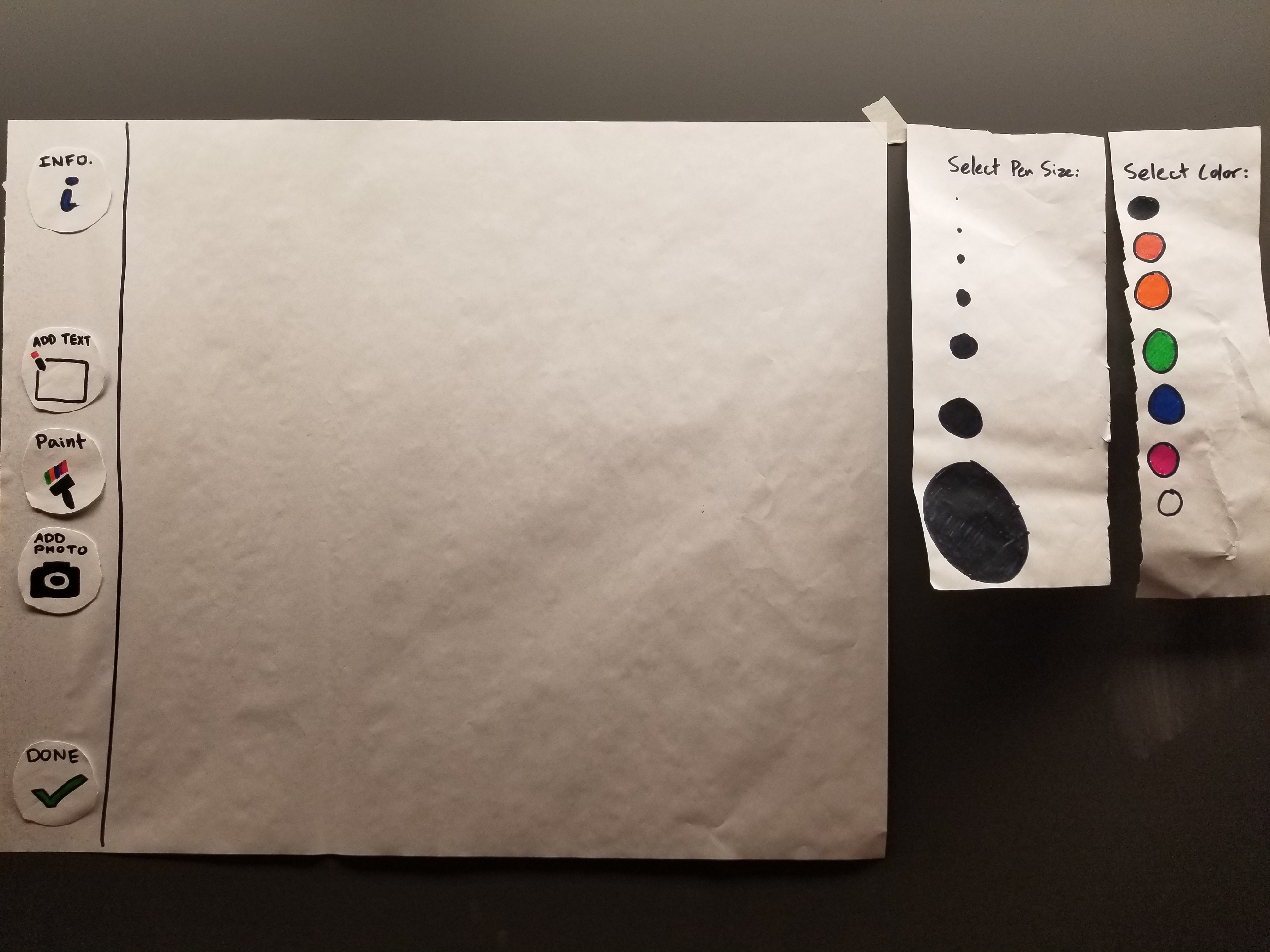 |
| Art Post | 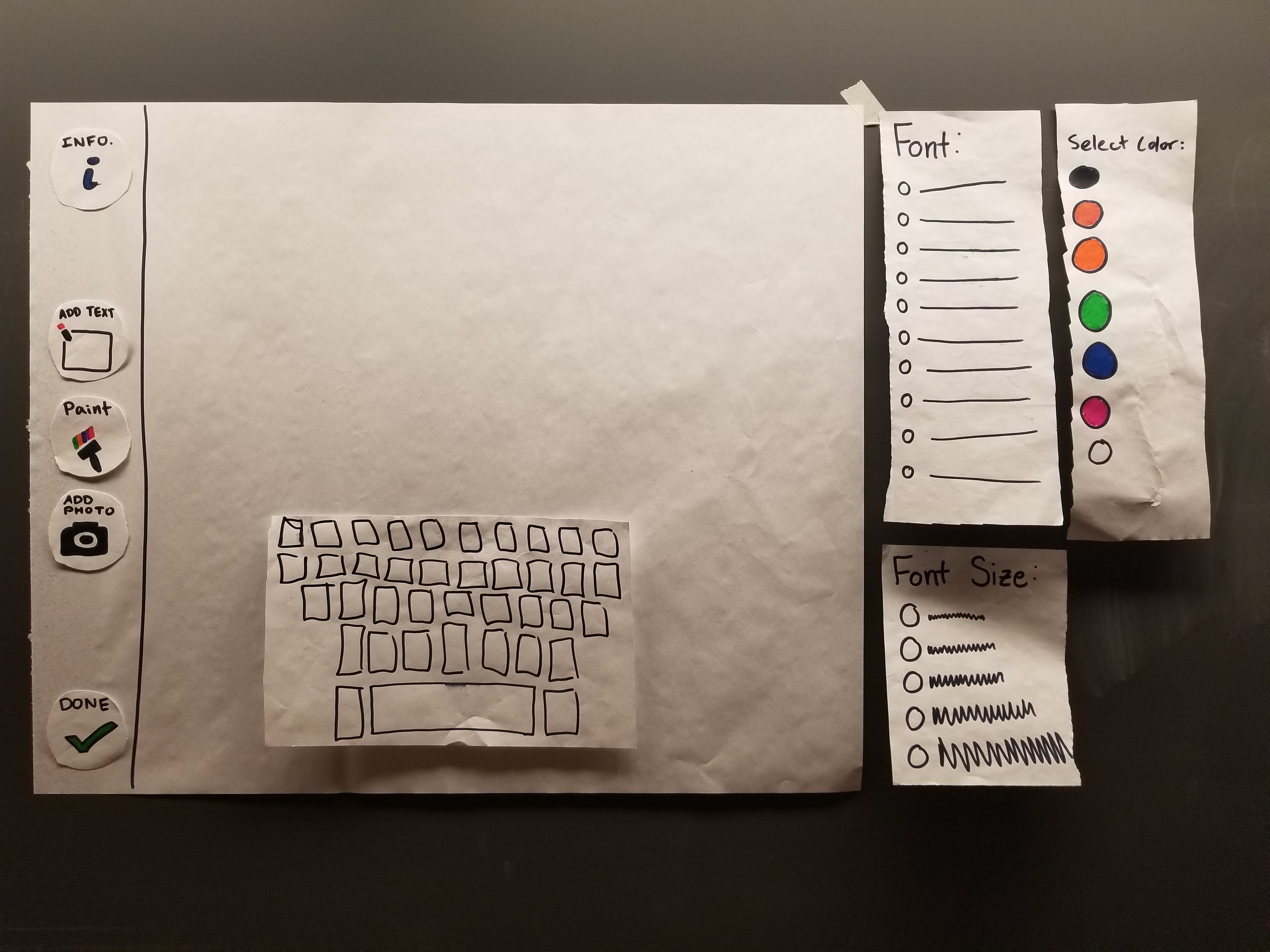 |
| Photo Post | 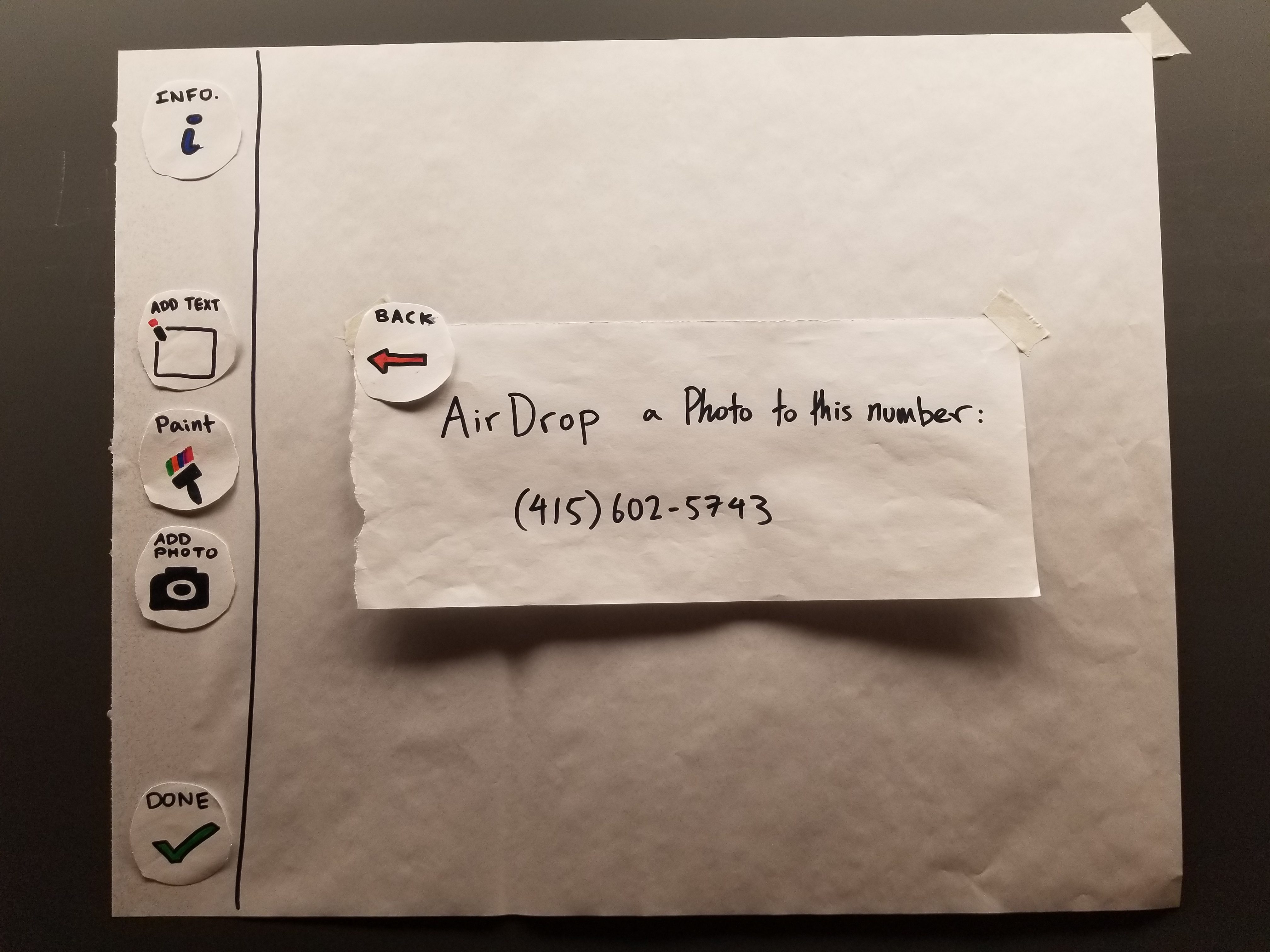 |
Digital Mockup
(1 paragraph) Present your digital mockup. Convey the critical aspects of your design, including your two primary tasks. Briefly discuss any changes you needed to make as you switched to your digital tools instead of paper. Briefly discuss any changes you made in response to critique. Include descriptions of how your design supports each of your primary tasks (e.g., one paragraph per task).
The Digital Design
Our group’s design, fortunately, was relatively easy to convert directly to a digital mockup with no necessary changes. As for our mockup, we still have yet to figure out how to allow users to actually draw/type content into the interface, but we have, at the least, implemented each of the buttons to have a follow-up screen. Though we have added a “search” feature in the politician screen, so that users can easily find a politician’s information if they already know them by name, this is a “dead” feature that is not critical towards accomplishing our desired tasks, but it can be easily implemented in our mockup later. Additionally, our politician screen currently displays the information of a single politician, many times over, but we feel as though this gives users enough of an idea how the design works. Overall, our paper and digital designs are very similar.
Mockup Overview
Below is an overview of our entire digital mockup:
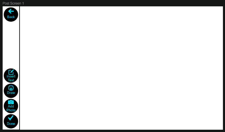
Task 1: Adding Art to Buildings
From the home screen, users click the “+,” after which point they are prompted to create art however they wish. Once they are done, they simply click “Done” and confirm to post content.
Below are images showing the screens of creating an art post:
 |
 |
 |
 |
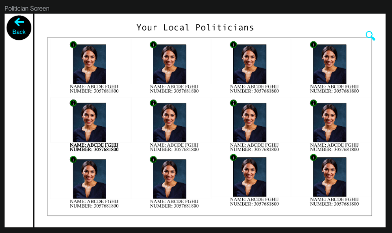
Task 2: Finding Politician Information
Starting at the home screen, users simply click “Info,” and then “here” to find information on their local politician.
Below are images of how users may learn the purpose of our product, as well as information on their local politician:
 |
 |
 |
Discussion
We learned that reviewing our own design is much like reading our own essay, in that it is very difficult to find mistakes in our own product. Especially when it comes to implementing a design that does not resemble anything that currently exists, it is exceptionally important to allow others to test our design, rather than reflecting upon it ourselves. Our design necessarily requires discovery, as it is not something a single user will use daily, but rather something many users will use multiple times. As a result, the discovery aspect of our design needs to be easy, or else users will get frustrated and give up.
Because our design’s mockup involves a lot of imagination, we also learned the difficulty of getting users to fully believe in imagining your product. This requires a lot of set-up and creativity in preparation for usability tests, as users will have a lot of questions or simply not uderstand what using the product is supposed to feel like, so it is important that they can visualize the experience beforehand to not get frustrated while using it.
Our experience shows that usability tests can really flip a design on its head, as almost every single aspect of our design (beyond the barebones layout) changed in some way, but in so doing it has become much more intuitive to use. We’ve also learned that although the few usability tests we conducted allowed us to iron out most of the large issues, there is always more to be done. For example, we believe that some A/B testing could be useful to further test design nuances, such as work flow and button styles. We also think that, given extensive testing options and time, the general design of accomplishing our tasks may have changed even further, because it would have given us the time to A/B test multiple workflow styles to see if one was more intuitive to users than another, which is yet another reason that we could have used more iterations upon our design.