The Digital Design
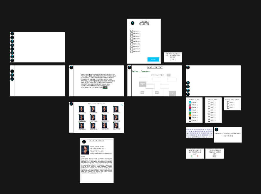
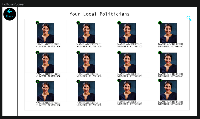
Our group’s design, fortunately, was relatively easy to convert directly to a digital mockup with no necessary changes. As for our mockup, we still have yet to figure out how to allow users to actually draw/type content into the interface, but we have, at the least, implemented each of the buttons to have a follow-up screen. One small difference, not mentioned in our paper prototype, is our decision to add a “search” feature in the politician screen, so that users can easily find a politician’s information if they already know them by name. As of yet, this is a “dead” feature that is not critical towards accomplishing our desired tasks, but it can be easily implemented in our mockup later. Additionally, our politician screen currently displays the information of a single politician, many times over, but we feel as though this gives users enough of an idea how the design works. Overall, our paper and digital designs are very similar.
Overview
Below is an overview of our entire digital mockup:
Task 1: Adding Art to Buildings
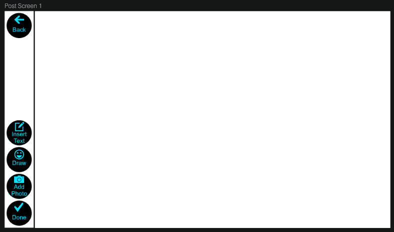
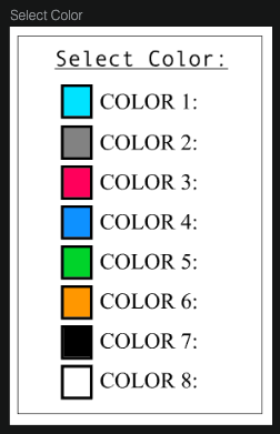
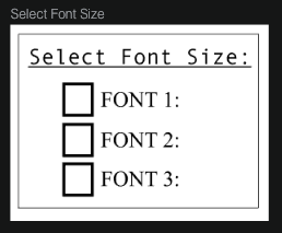
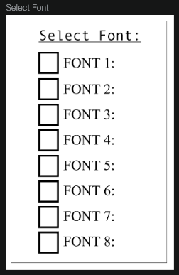
From the home screen, users click the “+,” after which point they are prompted to create art however they wish. Once they are done, they simply click “Done” and confirm to post content.
Below are images showing the screens of creating an art post:
 |
 |
 |
 |
Task 2: Finding Politician Information
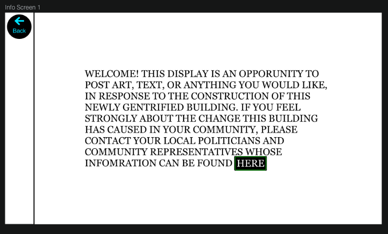
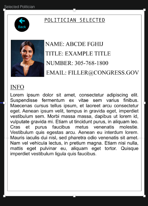
Starting at the home screen, users simply click “Info,” and then “here” to find information on their local politician.
Below are images of how users may learn the purpose of our product, as well as information on their local politician:
 |
 |
 |